Design Systems: Unified Brand Assets
Are you drowning in a sea of unorganized logos, inconsistent color palettes, and forgotten font files? The struggle to maintain brand integrity across…

Table of contents
- Tired of Brand Asset Chaos? The Unified Solution You Need in 2026
- What Exactly is a Design System for Brand Assets?
- Beyond Just Logos: The Core Components of a Unified Brand System
- How Design Systems Streamline Visual Communication
- The Tangible Benefits: Why Agencies & Freelancers Are Adopting Design Systems Now
- Boosting Efficiency: Faster Asset Retrieval and Application
- Enhancing Consistency: Eliminating Brand Drift Across Projects
- Improving Client Experience: Professionalism in Every Deliverable
- From Scattered Files to Single Source of Truth: Building Your Design System Foundation
- Inventorying Your Brand Assets: What to Include and How to Categorize
- Establishing Clear Naming Conventions and Folder Structures
- Leveraging Tools for Centralized Asset Management
- Key Elements of a Practical Design System for Brand Delivery
- Color Palettes: Defining Primary, Secondary, and Accent Colors
- Typography Hierarchy: Specs for Headings, Body Text, and Captions
- Iconography Standards: Guidelines for Style and Usage
- Imagery Guidelines: Photography, Illustrations, and Visual Tone
- The ‘One Link’ Handoff: Simplifying Client Deliveries with Design Systems
- Creating a Shareable, Accessible Brand Hub
- What Clients Actually Need: Essential Assets and Explanations
- Best Practices for Presenting Your Design System to Stakeholders
- Maintaining Your Design System: Evolution, Not Stagnation
- Establishing a Review and Update Cadence
- Incorporating Feedback from Design and Client Teams
- Versioning Your Assets for Clarity and Control
- Common Pitfalls to Avoid When Implementing a Design System
- Over-Engineering: Keeping it Practical for Your Workflow
- Lack of Documentation: The Importance of Clear Usage Instructions
- Ignoring Accessibility Standards: Designing for Inclusivity
- Design Systems in Action: Real-World Scenarios for Agencies and Freelancers
- Scenario 1: Onboarding a New Team Member
- Scenario 2: Delivering Assets for a New Marketing Campaign
- Scenario 3: Handling a Client’s Urgent Asset Request
- Future-Proofing Your Brand Delivery with a Robust Design System
- Adapting to New Platforms and Technologies
- Scaling Your Design System as Your Business Grows
- The Long-Term ROI of Organized Brand Assets
In today’s fast-paced digital landscape, where brand perception is paramount, clinging to outdated file management systems is no longer an option. The need for a cohesive, centralized system for all your visual identity elements has never been more critical. This is where the power of design systems truly shines, offering a strategic solution to tame brand asset chaos and elevate your creative output.
Tired of Brand Asset Chaos? The Unified Solution You Need in 2026
The fragmentation of brand assets across disparate cloud storage, local drives, and countless project folders is a pervasive issue in creative industries. This disarray leads to wasted time searching for the right file, accidental use of outdated versions, and ultimately, a diluted brand message. In 2026, as brands become more complex and the demand for rapid digital deployment intensifies, a fragmented approach to brand assets is a significant liability. Agencies and freelancers who embrace a unified system are positioning themselves for greater efficiency, stronger client relationships, and a more professional market presence.
A well-managed set of brand assets acts as the bedrock of any successful visual identity. Without it, the risk of brand drift – where a brand’s visual execution deviates from its core identity over time and across different touchpoints – becomes alarmingly high. This can erode consumer trust and brand recognition. Therefore, the adoption of a systematic approach to managing these assets isn’t just about organization; it’s about safeguarding the integrity and impact of the brands you work with, directly contributing to their success and your own reputation as a reliable creative partner. This is why many are looking to advanced platforms for organize brand assets: the one-link solution.
What Exactly is a Design System for Brand Assets?
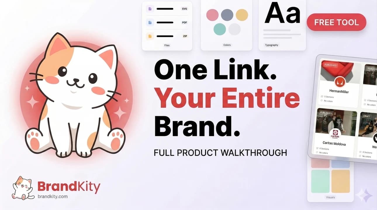
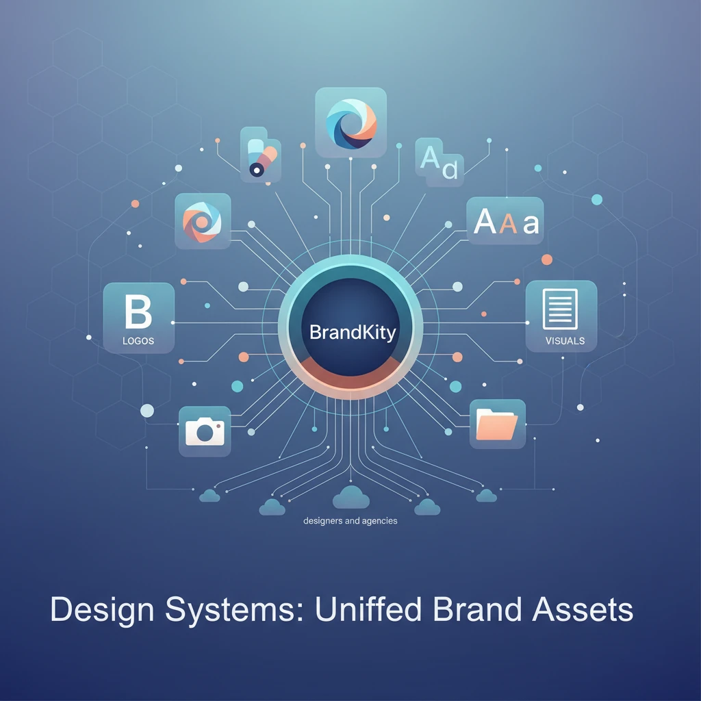
At its core, a design system for brand assets is a centralized, authoritative source of truth for all visual and identity-related components of a brand. It’s not just a collection of files; it’s a comprehensive framework that dictates how brand assets should be used, stored, and accessed. Think of it as the ultimate brand style guide, but with a dynamic, actionable component. This system typically includes design tokens (like colors, typography, spacing), UI components, code snippets, and, crucially for this discussion, a meticulously organized library of all brand-specific assets such as logos in various formats, imagery, icons, and illustrations. The goal is to ensure that everyone working with the brand – from designers and developers to marketers and external partners – is using the exact same, approved elements in the correct way.
This unified approach moves beyond the traditional static brand guidelines. Instead of a PDF that might become outdated or difficult to parse, a design system provides a living, breathing repository. It establishes a common language and set of rules for visual execution. This is particularly vital in environments with multiple contributors or when working across numerous projects and platforms simultaneously. By making these assets easily discoverable and understandable, a design system significantly reduces ambiguity and the potential for errors, ensuring that every touchpoint reinforces the brand’s intended identity. It’s about fostering a consistent and scalable way to represent a brand across all its manifestations, enabling teams to build and maintain a strong, coherent visual presence with confidence.
Beyond Just Logos: The Core Components of a Unified Brand System
While logos are often the most recognizable brand element, a truly unified brand system encompasses far more. It’s a comprehensive toolkit that empowers consistent visual communication. At its foundation are design tokens, the smallest, indivisible elements of a brand’s visual identity. This includes specific color palettes (primary, secondary, accent, semantic colors), typography scales (font families, weights, sizes, line heights), spacing values (margins, padding, grid systems), and iconography sets. Beyond these foundational tokens, the system includes specific brand assets like logos in all necessary formats (SVG, PNG, EPS) and variations (full color, monochrome, reversed), photography style guides and approved imagery libraries, illustration guidelines and a library of custom illustrations, and content elements such as testimonial formats or button styles.
Furthermore, a robust design system often extends to include component libraries. These are pre-built, reusable UI elements (like buttons, forms, cards, navigation bars) that are styled according to the brand’s guidelines. For digital products, this also extends to code snippets for developers, ensuring that the brand’s visual intent is translated accurately into functional interfaces. The aim is to provide designers and developers with everything they need, packaged in a way that encourages consistent application. This holistic approach, covering everything from the smallest color value to entire interactive components, ensures that the brand’s visual language is applied uniformly across all touchpoints, fostering a cohesive and professional user experience. For a deeper dive, consider exploring how these principles tie into effective pro brand assets: streamlined delivery.
How Design Systems Streamline Visual Communication
Design systems act as a central nervous system for brand communication, ensuring that every visual output speaks with a unified voice. By providing a single source of truth for all approved assets and usage guidelines, they eliminate the guesswork and subjective interpretation that often leads to inconsistencies. When designers, marketers, or developers need an asset, they know exactly where to find the correct, up-to-date version, significantly reducing the time spent searching through scattered folders or requesting it from colleagues. This immediate access accelerates project timelines and minimizes the risk of using off-brand elements, a common pitfall in rapid content creation.
Moreover, design systems codify best practices for asset application. This means that not only are the right assets available, but so are clear instructions on how to use them effectively. For instance, guidelines might specify the minimum clear space around a logo, the approved color combinations for calls to action, or the correct hierarchy for typography. This not only maintains brand integrity but also elevates the overall quality of the visual output. When every element is applied consistently and thoughtfully, the brand appears more professional, trustworthy, and memorable to its audience. This streamlined approach empowers teams to focus on creativity and strategy rather than the mechanics of asset management, leading to more impactful and cohesive brand experiences. The benefits are so profound that many professionals are seeking ways to streamline your agency’s brand delivery.
The Tangible Benefits: Why Agencies & Freelancers Are Adopting Design Systems Now
In the competitive landscape of 2026, efficiency, consistency, and client satisfaction are the cornerstones of agency and freelancer success. Design systems directly address these critical needs, offering tangible benefits that translate into improved workflows, higher-quality deliverables, and stronger client relationships. For agencies, a well-implemented design system means less time spent on repetitive tasks and more time dedicated to strategic creative work. Freelancers gain a professional edge, able to manage multiple client brands with greater ease and deliver a polished, consistent product every time. The adoption of these systems is no longer a niche practice but a strategic imperative for those aiming for sustained growth and a reputation for excellence. This shift is driven by a clear understanding of the return on investment in streamlined brand asset management.
The ability to deliver a professional and cohesive brand experience across all client projects is a significant differentiator. Clients expect their brand to be represented accurately and consistently, whether it’s on a website, social media, marketing collateral, or internal documents. A design system ensures this uniformity, preventing the visual fragmentation that can undermine a brand’s credibility. This reliability fosters trust and strengthens the agency-client partnership. Ultimately, embracing design systems is about future-proofing your business, adapting to evolving client expectations, and building a more sustainable, efficient, and professional operation. It’s about moving from a reactive approach to asset management to a proactive, strategic one.
Boosting Efficiency: Faster Asset Retrieval and Application
One of the most immediate and impactful benefits of a design system is the dramatic increase in efficiency. Instead of designers and marketers hunting through a labyrinth of shared drives, email threads, and forgotten project folders for the correct logo file or color hex code, a centralized system puts everything at their fingertips. This rapid asset retrieval means less time is wasted searching and more time is spent on creative execution. Imagine a scenario where a designer needs the brand’s primary logo in SVG format for a web banner; with a design system, this asset can be found and downloaded in seconds, rather than minutes or even hours of searching. This speed directly translates into faster project completion and the ability to take on more work.
Beyond just finding assets, design systems streamline their application. Pre-defined components, color palettes, and typography scales ensure that elements are used correctly and consistently from the outset. This reduces the need for rework due to stylistic inconsistencies or incorrect usage. For example, if a developer needs to implement a button, they can pull a pre-coded, on-brand button component directly from the system, rather than having to build it from scratch and guess at the correct styling. This not only saves development time but also guarantees visual fidelity across the entire user experience. For agencies and freelancers focused on high-volume output, this boost in operational efficiency is paramount, making it easier to boost agency efficiency: asset delivery.
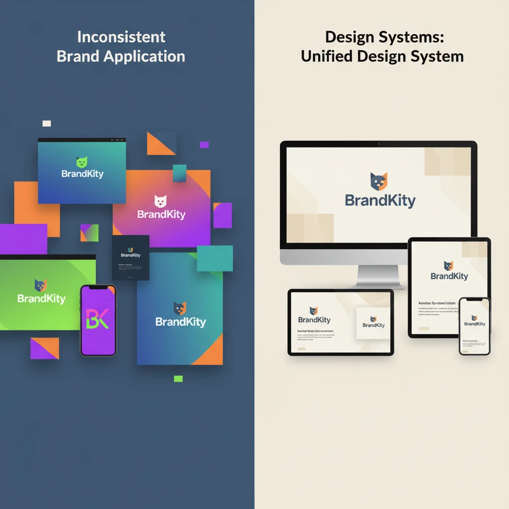
Enhancing Consistency: Eliminating Brand Drift Across Projects
Brand drift, the gradual erosion of a brand’s visual identity over time due to inconsistent application, is a silent killer of brand recognition. A design system acts as a powerful antidote. By providing a single source of truth for all visual elements – from the precise shade of a brand color (e.g., 007bff) to the specific weight and size of a font for headings – it ensures that every individual working on the brand adheres to the same standards. This eliminates subjective interpretations of brand guidelines, which are often the root cause of inconsistencies. Whether a new campaign is launched, a website is updated, or social media graphics are created, the design system ensures that the brand’s core visual language remains intact.
This enhanced consistency is not just an aesthetic win; it builds stronger brand equity. When a brand’s visual presentation is uniform across all touchpoints, it becomes more recognizable, memorable, and trustworthy. Consumers develop a clear understanding of what the brand looks and feels like, fostering a sense of reliability and professionalism. For agencies and freelancers, this means delivering a more polished and cohesive product to clients, strengthening their reputation and reducing the likelihood of client feedback centered around visual discrepancies. It allows for a more predictable and controlled brand experience, essential in today’s crowded marketplace. This focus on consistency is key to truly mastering brand delivery: a practical guide.
Improving Client Experience: Professionalism in Every Deliverable
The way brand assets are delivered and managed directly impacts a client’s perception of your professionalism and competence. When clients receive a well-organized, easy-to-navigate package of their brand assets, it signals that you have a structured and thoughtful approach to their project. This contrasts sharply with clients who receive a disorganized collection of files, leading them to question the overall quality of your services. A design system, when utilized for client handoffs, ensures that they receive everything they need in a clear, logical format, making their own internal use of the brand assets straightforward and efficient.
This enhanced client experience extends beyond the initial handover. When your deliverables consistently reflect the client’s brand guidelines with precision, it builds confidence and reduces the need for them to provide extensive feedback on visual execution. They see that you understand and respect their brand identity, fostering a stronger working relationship. For agencies, this can lead to increased client retention and positive referrals. For freelancers, it establishes a reputation for reliability and quality, attracting more discerning clients. Ultimately, by treating brand assets with the systematic care they deserve, you elevate the client’s entire experience, making them feel valued and assured of your expertise, which is crucial for avoiding client confusion? Master brand asset delivery.
From Scattered Files to Single Source of Truth: Building Your Design System Foundation
Transitioning from a chaotic collection of brand assets to a structured design system requires a systematic approach. The first crucial step is a comprehensive inventory and audit of all existing brand assets. This involves identifying every logo variation, color palette, typeface, image library, icon set, and any other visual element currently in use across all projects and clients. Documenting the format, version, and intended use of each asset is vital. This audit will not only reveal redundancies and inconsistencies but also highlight any missing or outdated elements that need to be addressed. Understanding the full scope of what you have is the foundational step before you can organize it effectively, setting the stage for a truly unified brand asset strategy.
Once you have a clear picture of your existing assets, establishing robust organizational principles becomes paramount. This includes defining clear naming conventions and logical folder structures. A consistent naming system (e.g., `logo_primary_fullcolor_rgb.svg` or `color_accent_blue_hex_007bff`) makes files instantly identifiable and searchable. Similarly, a well-thought-out folder hierarchy (e.g., `/logos/vector/`, `/logos/raster/`, `/colors/`, `/typography/`) ensures that related assets are grouped together logically. This systematic organization is the backbone of making your brand assets easily accessible and manageable for everyone on your team and for your clients, preventing the return of disorganization. Consider how this aligns with the goal to stop asset chaos: simple brand delivery.
Inventorying Your Brand Assets: What to Include and How to Categorize
A thorough inventory is the bedrock of any design system. For brand assets, this means going beyond just the logo. You need to meticulously catalog all visual elements that define a brand’s identity. This includes primary and secondary logos, their variations (e.g., stacked, horizontal, icon-only), and all available file formats (AI, EPS, SVG for vector; PNG, JPG for raster). Don’t forget color palettes – document all primary, secondary, and accent colors, along with their HEX, RGB, CMYK, and Pantone values. Typography is another critical component: list all approved fonts, their weights, and specific usage guidelines (e.g., which font for headings, body text, captions).
Beyond these core elements, the inventory should also encompass imagery guidelines and approved stock or custom photography libraries, illustration styles and existing illustrations, iconography (both individual icons and icon sets), and any other unique brand elements like patterns, textures, or graphic devices. Categorizing these assets is key. A common approach is to group them by type: Logos, Colors, Typography, Imagery, Icons, Illustrations, etc. Within these categories, further sub-categorization based on format (vector, raster), usage (print, web), or variation (color, monochrome) can make retrieval even more efficient. This detailed approach ensures that no visual asset is overlooked, providing a comprehensive foundation for your design system, crucial for optimizing agency efficiency: brand delivery.
Establishing Clear Naming Conventions and Folder Structures
The backbone of an accessible brand asset library lies in its organization, and that starts with consistent naming conventions. Without them, searching for a specific file can feel like looking for a needle in a haystack. A good naming convention should be descriptive yet concise, providing enough information to identify the asset’s purpose, format, and any variations without being overly verbose. For example, instead of just `logo.png`, a better name would be `brandname_logo_primary_fullcolor_rgb_2024.png`. Including the year or version number can also be beneficial for tracking updates.
Complementing naming conventions is the establishment of a logical and scalable folder structure. This structure should intuitively group similar assets together. A common hierarchy might include top-level folders for major categories like `Logos`, `Colors`, `Typography`, `Imagery`, `Icons`, and `Illustrations`. Within these, you can create subfolders based on file type (e.g., `Vector`, `Raster`), usage (e.g., `Print`, `Web`), or specific variations (e.g., `Monochrome`, `Stacked`, `Backgrounds`). The goal is to create a system that is easy for anyone to navigate, quickly locate what they need, and understand where new assets should be placed. This structured approach is fundamental to making brand asset management effective and reducing time spent on agency ace brand asset delivery.
Leveraging Tools for Centralized Asset Management
Manual organization of brand assets, while a starting point, quickly becomes unmanageable as brands and projects grow. This is where specialized digital asset management (DAM) tools and platforms come into play. These tools are designed to centralize, organize, and distribute brand assets efficiently. They often feature robust search functionalities, allowing users to find assets quickly using keywords, tags, or filters. Many DAM systems also support version control, ensuring that users always access the latest approved versions of an asset, thereby preventing brand drift.
Beyond simple storage, these platforms facilitate controlled access and sharing. You can grant specific permissions to different users or teams, ensuring that only authorized individuals can download or edit certain assets. Features like automated metadata tagging, file format conversion, and usage analytics further enhance efficiency and provide valuable insights into how brand assets are being utilized. For agencies and designers, utilizing a platform like BrandKity can consolidate all these capabilities into a single, professional link, simplifying client handoffs and internal workflows. This move towards a centralized, technology-driven approach is essential for maintaining brand integrity and operational agility in the modern creative landscape, embodying the concept of a design systems: asset delivery hub.
Key Elements of a Practical Design System for Brand Delivery
A robust design system moves beyond a mere style guide to become a centralized source of truth for all brand assets. For effective brand delivery, its core components must be meticulously defined and easily accessible. This unification prevents brand fragmentation across various platforms and touchpoints. Think of it as the blueprint and toolkit for consistent brand representation. Decision criteria for establishing these elements include scalability, maintainability, and ease of adoption by diverse teams. A practical design system should be flexible enough to accommodate evolving brand needs while remaining rigid enough to enforce consistency. Consider the long-term impact: a well-defined system can significantly reduce the time and resources spent on repetitive design tasks and asset retrieval. This proactive approach ensures that every piece of visual communication aligns perfectly with the brand’s identity, fostering trust and recognition with the target audience. Prioritizing these foundational elements is crucial for any organization aiming for a cohesive and powerful brand presence in today’s crowded marketplace.
Color Palettes: Defining Primary, Secondary, and Accent Colors
The color palette is foundational to a brand’s visual identity. A design system must clearly define primary colors, which are the most dominant hues and should be used consistently across major brand elements like logos and headlines. Secondary colors provide complementary or supplementary options, offering flexibility for different applications and UI elements. Finally, accent colors are critical for drawing attention to key calls-to-action, interactive elements, or important information, ensuring they stand out effectively. When defining these, consider their emotional impact, accessibility (contrast ratios), and how they will render across different media (print vs. digital). For instance, ensure sufficient contrast between text and background colors to meet Web Content Accessibility Guidelines (WCAG). A practical approach involves specifying HEX, RGB, and CMYK values for each color to avoid discrepancies in reproduction. Documenting the intended usage for each color category – e.g., primary for logos and main headings, secondary for sub-sections and supportive graphics, and accent for buttons and alerts – is paramount for consistent application.
Typography Hierarchy: Specs for Headings, Body Text, and Captions
A well-defined typography hierarchy is essential for readability and establishing a clear visual structure. Your design system needs to specify the fonts to be used, including fallbacks for web compatibility. For each font, detail the weights (e.g., Regular, Bold, Light) and their designated roles. This includes specifications for H1 through H6 headings, outlining font size, line height, letter spacing, and color for each level. Crucially, define the characteristics of body text, such as default size, line height, and paragraph spacing, to ensure comfortable reading. Don’t forget captions and smaller text elements, which require similar detailed specifications to maintain legibility. Practical considerations involve ensuring font choices are legible across various screen sizes and devices. Actionable steps include creating actual typographic scales (e.g., using a modular scale) to ensure harmonious relationships between different text sizes. This systematic approach prevents arbitrary font choices and guarantees a consistent, professional look and feel across all communications.
Iconography Standards: Guidelines for Style and Usage
Icons are powerful visual communicators, and their consistent application is key to a unified brand experience. Your design system should establish clear iconography standards, dictating the visual style – whether line-based, filled, glyph, or custom illustrations. Specify the stroke weights, corner radii, and overall aesthetic. Beyond style, define usage guidelines: which icons should be used for specific functions (e.g., a shopping cart for e-commerce, a gear for settings). Crucially, outline rules for sizing and spacing around icons to ensure they are easily recognizable and don’t clutter layouts. Providing icons in various formats (SVG for scalability, PNG for fallback) is a practical necessity. A common pitfall is allowing a free-for-all with icon libraries, leading to a disjointed appearance. By providing a curated set of approved icons with explicit usage instructions, you empower designers and developers to maintain brand consistency effortlessly, enhancing user experience through clear visual cues.
Imagery Guidelines: Photography, Illustrations, and Visual Tone
Imagery plays a significant role in conveying a brand’s personality and message. A comprehensive design system must include guidelines for photography, illustrations, and other visual assets. For photography, define the desired subject matter, composition styles, color grading, and overall mood (e.g., aspirational, relatable, technical). If illustrations are part of the brand, specify the artistic style, color usage, and complexity. Beyond individual asset types, establish a consistent visual tone that permeates all imagery, ensuring it aligns with the brand’s voice and values. Actionable steps include creating mood boards and providing examples of “do” and “don’t” scenarios for image selection. This prevents generic stock photos or off-brand visuals from diluting the brand identity. For example, a tech company might specify clean, minimalist illustrations and aspirational product photography, while a wellness brand might opt for natural, lifestyle photography and softer, organic illustration styles.
The ‘One Link’ Handoff: Simplifying Client Deliveries with Design Systems
Transitioning from a comprehensive design system to a streamlined client handoff is where the real value of unification shines. The concept of a “one link” handoff, powered by a well-organized design system, fundamentally transforms how agencies and designers deliver brand assets. Instead of bombarding clients with multiple folders or file-sharing links, a single, curated URL provides access to everything they need. This approach not only simplifies the process for the client, reducing confusion and potential errors, but also elevates the professionalism of the delivery. It consolidates disparate elements—logos, colors, fonts, imagery guidelines, and even interactive components—into an easily navigable and branded experience. The decision to adopt this method hinges on the desire to reduce post-delivery support queries and empower clients to use brand assets correctly and efficiently. This methodical approach to asset delivery, as highlighted in resources on mastering brand delivery, can significantly boost agency efficiency and client satisfaction.
Creating a Shareable, Accessible Brand Hub
The core of a “one link” handoff is a dedicated brand hub, essentially a living repository of all approved brand assets. This hub should be designed for clarity, ease of navigation, and accessibility. Decision criteria for building this hub include ensuring it’s mobile-responsive, searchable, and allows for granular access control if needed. Key elements to include are brand logos in various formats (SVG, PNG, JPG) and sizes, defined color palettes with clear usage, typography specifications, icon libraries, and detailed imagery guidelines. Think of it as a user-friendly portal where clients or internal teams can find exactly what they need, when they need it, without sifting through endless files. This structure is vital for maintaining brand consistency across all applications. Implementing features like download buttons for individual assets and clear descriptions of their intended use makes the hub highly practical. This approach ensures that everyone engaging with the brand is working from the same, accurate information, greatly simplifying brand assets and their simplification of client delivery.
What Clients Actually Need: Essential Assets and Explanations
While designers might be adept at navigating complex asset libraries, clients often require a more curated and explained experience. The “one link” handoff should prioritize clarity and context for the end-user. Essential assets for clients typically include logo variations (primary, secondary, favicon), core color swatches with simple application notes, essential typography families and their most common uses (e.g., headings, body copy), and a selection of key icons. Beyond just providing files, clear, concise explanations of how and why these assets should be used are invaluable. For example, instead of just listing HEX codes, explain that certain colors are for primary branding and others are for calls to action. This educational component is crucial for empowering clients and reducing misinterpretations. A practical approach is to include short video tutorials or FAQs within the hub to address common client queries, further enhancing their understanding and confidence in using the brand assets correctly.
Best Practices for Presenting Your Design System to Stakeholders
Successfully integrating a design system into client workflows requires effective presentation. When sharing the “one link” brand hub, focus on demonstrating its value proposition clearly. Start by outlining the benefits of a unified brand experience, such as enhanced recognition, stronger brand recall, and a professional image. Showcase the ease of access and navigation, perhaps with a brief walkthrough or a short demo video. Explain how the system empowers them to use assets correctly, thereby avoiding common pitfalls. Decision criteria for presentation should include understanding the audience’s technical proficiency; tailor the language and depth of detail accordingly. For non-design stakeholders, emphasize the business advantages and time savings. Actionable steps include preparing a concise executive summary and having a live demo ready to address questions. This proactive and value-driven approach ensures buy-in and facilitates smooth adoption. Effectively communicating the design system’s advantages can significantly boost agency efficiency in asset delivery.
Maintaining Your Design System: Evolution, Not Stagnation
A design system is not a static document; it’s a living entity that requires ongoing care and adaptation. To remain effective and relevant, it must evolve alongside the brand, user needs, and technological advancements. The key to successful maintenance lies in understanding that stagnation leads to obsolescence. Establishing a deliberate process for updates and reviews ensures the system continues to serve its purpose: providing a consistent and efficient brand experience. This involves creating mechanisms for feedback, implementing a clear versioning strategy, and defining a rhythm for evaluation. Neglecting maintenance can lead to outdated assets, inconsistencies, and a loss of trust in the system itself. Therefore, dedicating resources and attention to its upkeep is as critical as its initial creation. A proactive approach to maintenance ensures the design system remains a valuable asset, continually supporting and strengthening the brand’s identity and delivery processes. It’s about fostering a culture of continuous improvement around your brand’s visual language.
Establishing a Review and Update Cadence
To ensure your design system remains a relevant and authoritative source, a structured review and update cadence is essential. This means setting regular intervals, whether quarterly or bi-annually, for a comprehensive review of all system components. During these reviews, assess existing elements for accuracy, relevance, and adherence to current brand strategy. Decision criteria for timing these reviews could align with product release cycles, marketing campaign launches, or annual brand strategy refreshes. Actionable steps include assigning ownership for the review process to a specific team or individual. This prevents items from falling through the cracks. Consider the impact of emerging design trends, new accessibility standards, and evolving user expectations. A proactive update strategy might involve scheduled checkpoints to proactively address potential issues before they impact brand consistency or user experience. For example, if new accessibility guidelines are released, the cadence should allow for timely integration.
Incorporating Feedback from Design and Client Teams
A design system thrives when it’s a collaborative effort, and incorporating feedback from both internal design teams and external clients is crucial for its evolution. Establish clear channels for submitting suggestions, reporting issues, or requesting new assets. This could take the form of a dedicated Slack channel, a Trello board, or a specific form within the design system platform itself. When considering feedback, prioritize changes that enhance usability, improve consistency, or address identified pain points. For instance, if multiple designers report difficulty finding a specific logo variation, that’s a strong signal for an update. Similarly, client feedback regarding the clarity of asset usage instructions can lead to improved documentation. Decision criteria for incorporating feedback should balance the need for updates with the imperative to maintain core consistency. This iterative process ensures the design system remains practical, user-friendly, and accurately reflects the needs of all stakeholders, thereby streamlining your agency’s brand delivery.
Versioning Your Assets for Clarity and Control
Effective versioning is a cornerstone of design system maintenance, providing clarity and control over asset evolution. Implement a clear versioning strategy, such as semantic versioning (e.g., v1.0.0, v1.1.0, v2.0.0), to track changes and updates. Major version updates (e.g., v2.0.0) should signify significant changes or redesigns, while minor updates (e.g., v1.1.0) might indicate additions or non-breaking improvements. Each asset within the system should ideally have a version history associated with it. Decision criteria for versioning should prioritize easy identification of the latest stable version and the ability to revert to previous versions if necessary. Actionable steps include clearly labeling updated assets with their new version numbers and providing release notes detailing the changes made in each update. This meticulous approach prevents confusion, ensures that everyone is using the most current approved assets, and simplifies troubleshooting if issues arise, safeguarding the integrity of the brand’s visual identity and organizing brand assets via the one-link solution.
Common Pitfalls to Avoid When Implementing a Design System
While the benefits of design systems are significant, their implementation is not without challenges. Many organizations stumble into common pitfalls that undermine the system’s effectiveness and adoption. Over-engineering a system, failing to provide adequate documentation, or neglecting accessibility standards are frequent missteps. The goal of a design system is to simplify and standardize, yet poorly implemented systems can create new layers of complexity or exclude important user groups. Understanding these potential traps beforehand allows for proactive mitigation strategies. The true success of a design system is measured not just by its creation, but by its consistent and effective use across an organization and by its clients. Avoiding these common errors is crucial for ensuring the design system delivers on its promise of efficiency, consistency, and a superior brand experience. This proactive awareness can save significant time and resources in the long run.
Over-Engineering: Keeping it Practical for Your Workflow
A common pitfall is the temptation to build an overly complex and comprehensive design system from the outset. This “over-engineering” can lead to a system that is difficult to manage, understand, and adopt. Decision criteria for what to include should focus on the most critical and frequently used brand elements first. Start with core components like logos, primary colors, and essential typography. Gradually expand the system as needs become clearer and adoption grows. Avoid creating granular components for every conceivable scenario if they are rarely used. The aim is to create a practical, usable toolkit that genuinely streamlines workflows, rather than an exhaustive encyclopedia that becomes overwhelming. Actionable steps include prioritizing components based on frequency of use and impact on brand consistency. For example, a simpler system for a small agency focusing on delivering consistent client assets might be more effective than an overly complex one designed for a large enterprise with diverse product lines.
Lack of Documentation: The Importance of Clear Usage Instructions
Even the most meticulously designed assets are rendered ineffective if users don’t know how to use them correctly. A significant pitfall in design system implementation is the lack of comprehensive and clear documentation. This includes not only technical specifications but also qualitative guidelines on when and why to use certain elements. Decision criteria for documentation should prioritize clarity, conciseness, and accessibility for all user levels, from junior designers to non-technical stakeholders. Provide explanations for color usage, appropriate logo placements, typography hierarchy rules, and desired visual tone for imagery. Actionable steps include creating a dedicated “Usage Guidelines” or “Brand Manual” section within the design system’s documentation. This section should feature real-world examples, “do’s and don’ts,” and FAQs. Without this guidance, users are left to guess, leading to inconsistencies and brand dilution, which directly impacts client confusion and the need to master brand asset delivery.
Ignoring Accessibility Standards: Designing for Inclusivity
A critical and often overlooked pitfall is the failure to integrate accessibility standards into the design system from its inception. A design system that doesn’t account for inclusivity excludes a significant portion of users and can lead to legal and ethical issues. Decision criteria for accessibility should align with current standards, such as WCAG (Web Content Accessibility Guidelines). This means defining color contrast ratios for text and interactive elements, specifying legible font sizes and line heights, and ensuring icons have clear, descriptive labels or alt text. Actionable steps include conducting regular accessibility audits of the design system’s components and providing developers with clear guidelines on how to implement them accessibly. For example, specifying minimum text sizes for body copy or outlining requirements for focus states on interactive elements ensures that the brand is perceivable and operable by everyone. Prioritizing accessibility from the start makes it a foundational element, not an afterthought, ultimately leading to a more robust and inclusive brand experience.
Design Systems in Action: Real-World Scenarios for Agencies and Freelancers
A well-implemented design system moves beyond a theoretical concept to become a practical tool that significantly impacts daily operations for creative professionals. For agencies and freelancers alike, it translates to streamlined workflows, reduced errors, and enhanced client satisfaction. Instead of digging through disparate folders or relying on ad-hoc communication, a design system acts as a single source of truth for all brand elements. This centralized approach ensures consistency across all outputs, which is paramount for maintaining a strong brand identity. Furthermore, it fosters a collaborative environment by providing a clear and accessible repository for every approved asset, brand guideline, and usage rule.
Scenario 1: Onboarding a New Team Member
Bringing new talent onto a design team often involves a steep learning curve. Without a design system, a junior designer might spend days deciphering a client’s brand, searching for correct file versions, and understanding usage restrictions. This can lead to costly mistakes and delays. With a design system, however, the onboarding process is dramatically simplified. A new team member can access a comprehensive library of approved logos, color palettes, typography rules, imagery guidelines, and even pre-defined UI components. The system should include clear documentation on how to use these assets, alongside examples of both correct and incorrect applications. This not only speeds up their integration but also ensures they begin contributing with confidence and adherence to brand standards from day one. For instance, a design system can include a dedicated section for foundational brand elements, such as the official logo files in various formats (SVG, PNG, EPS) and clear instructions on minimum size and clear space. This immediate access to validated brand assets prevents the common pitfall of using outdated or incorrect versions, which can dilute brand integrity.
Scenario 2: Delivering Assets for a New Marketing Campaign
Launching a new marketing campaign requires a swift and accurate delivery of numerous assets. Imagine a situation where a client needs social media graphics, banner ads, and email templates – all bearing the exact same brand look and feel. If assets are scattered across different cloud storage folders or individual designer drives, the process becomes a chaotic scramble. A design system, particularly one with a robust organization system, allows for the quick generation and delivery of these assets. Pre-approved templates, standardized color swatches, and accessible font libraries ensure that all campaign materials are not only visually cohesive but also technically compliant with brand guidelines. For example, a design system might contain a library of editable graphic templates for social media, pre-set with brand colors and fonts, allowing designers to populate them with campaign-specific content rapidly. This capability is crucial for meeting tight deadlines and maintaining brand consistency across diverse marketing channels, ultimately contributing to a more effective and cohesive campaign.
Scenario 3: Handling a Client’s Urgent Asset Request
Clients often have urgent needs for specific brand assets, perhaps for a last-minute presentation or an unexpected media opportunity. In a traditional workflow, fulfilling such a request might involve searching through emails, project folders, or even contacting previous team members. This is inefficient and can lead to client frustration. A design system, acting as a central asset delivery hub, resolves this issue instantly. A single, shareable link can provide the client or their designated representative with immediate access to all required assets. The system should be structured intuitively, allowing users to easily find logos, specific color codes (HEX, RGB, CMYK), brand fonts, and even approved imagery. For instance, a client might request a high-resolution logo for a print publication. With a design system, the agency can simply share the relevant link, and the client can download the correct file format in seconds, avoiding delays and ensuring uninterrupted brand representation. This capability significantly enhances client trust and demonstrates the agency’s professionalism and efficiency, which is vital for preventing client confusion.
Future-Proofing Your Brand Delivery with a Robust Design System
The digital landscape is constantly evolving, with new platforms, devices, and technologies emerging regularly. A static approach to brand assets quickly becomes outdated, leading to compatibility issues and a diluted brand presence. A robust design system, however, is built with adaptability in mind, providing a framework that can evolve alongside these changes. It’s not just about storing existing assets; it’s about creating a flexible structure that can accommodate future needs. This proactive approach ensures that brands can maintain their integrity and effectiveness across all touchpoints, from emerging AR/VR experiences to new social media platforms. By focusing on the principles of modularity and scalability within the design system, businesses can ensure their brand remains consistent and relevant, ultimately safeguarding their long-term brand equity.
Adapting to New Platforms and Technologies
As new digital frontiers emerge, such as augmented reality (AR), virtual reality (VR), or interactive web experiences, brand assets must be adapted to perform optimally within these environments. A well-designed system anticipates this by defining core principles and flexible asset types. For example, instead of just storing static logos, a design system might include guidelines for creating 3D logos or animated brand elements. Similarly, color palettes can be defined with accessibility standards in mind, ensuring they function well on different display technologies and lighting conditions. The system should also provide a clear process for evaluating and integrating new asset formats required by emerging platforms. This might involve creating modular UI components that can be easily reconfigured for different screen sizes and interaction models, ensuring a consistent brand experience regardless of the medium. This forward-thinking approach is essential for maintaining relevance and avoiding costly redesigns down the line, supporting efforts to master brand delivery across all channels.
Scaling Your Design System as Your Business Grows
As an agency or freelance business expands, so too will its client base and the complexity of its projects. A design system must be capable of scaling to accommodate this growth. Initially, it might focus on core brand elements for a few clients. However, as the business evolves, the system needs to incorporate more granular details, accommodate a larger number of brand guidelines, and potentially integrate with project management tools for seamless asset management. This means establishing clear hierarchies within the system, defining roles and permissions for asset management, and developing processes for updating and archiving assets. For instance, a growing agency might implement version control for all assets, ensuring that past iterations are preserved while current standards are easily identifiable. This scalability prevents the system from becoming a bottleneck and ensures that efficient brand delivery remains a core strength, similar to how one might streamline your agency’s brand delivery process.
The Long-Term ROI of Organized Brand Assets
Investing in a comprehensive design system yields significant long-term return on investment (ROI). The initial effort of establishing and maintaining the system is offset by substantial savings in time, resources, and reduced errors. By centralizing and standardizing brand assets, teams spend less time searching for files, correcting inconsistencies, or redoing work. This increased efficiency translates directly into higher productivity and profitability. Furthermore, a strong design system enhances client satisfaction by ensuring consistent, professional brand delivery, which can lead to repeat business and referrals. For example, an agency that consistently delivers high-quality, on-brand assets can reduce project turnaround times by an estimated 20% and cut down on costly rework by 15%, according to hypothetical agency metrics. This demonstrates the tangible financial benefits of treating brand assets not just as files, but as a strategic component of service delivery, significantly improving asset delivery efficiency.
Saurabh Kumar
Founder, BrandKity
Saurabh writes about practical brand systems, faster client handoffs, and scalable workflows for designers and agencies building repeatable delivery operations.
Connect on LinkedIn