Ace Brand Delivery: Designer’s Workflow
In today’s fast-paced digital landscape, the way brands are delivered to clients can make or break a designer’s reputation and a client’s confidence. …
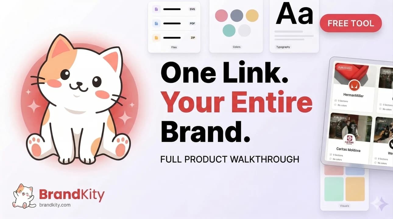
Table of contents
- The Ultimate Brand Handoff: From Concept to Client Confidence
- The common pain points of traditional brand delivery.
- Why a structured workflow is non-negotiable in 2026.
- Pre-Delivery: Organizing Your Masterpiece for Clarity
- Establishing a consistent naming convention for all assets.
- Creating a master folder structure that makes sense (e.g., by asset type, project phase).
- Version control strategies: knowing which file is the final one.
- Defining Your Brand’s DNA: The Core Asset Checklist
- Essential logo variations (primary, secondary, favicon, app icon).
- Color palettes: primary, secondary, accent, and their hex/RGB/CMYK values.
- Typography hierarchy: font families, weights, sizes, and usage examples.
- Key imagery and visual style guidelines.
- Beyond the Basics: Packaging Supplementary Brand Elements
- Iconography sets and their intended application.
- Illustrative styles and character sheets (if applicable).
- Templates for social media, presentations, or print collateral.
- The Power of ‘One Link’: Streamlining Client Access
- Why a single, shareable link is a game-changer.
- Structuring your delivery link for intuitive navigation.
- Best practices for setting permissions and access levels.
- Crafting Clear Brand Guidelines: More Than Just a PDF
- Moving beyond static documents to interactive experiences.
- Showcasing do’s and don’ts with visual examples.
- Integrating usage instructions for different asset types.
- Client Collaboration: Setting Expectations for a Smooth Handoff
- Communicating your delivery process upfront.
- Providing a walkthrough of the delivered assets.
- Establishing a clear point of contact for questions.
- Post-Handoff: Ensuring Adoption and Future-Proofing
- Encouraging clients to save the delivery link for future reference.
- Anticipating common client questions and preparing answers.
- Strategies for updating brand assets as the brand evolves.
- From Freelancer to Agency: Scaling Your Brand Delivery Process
- Standardizing workflows for multiple designers.
- Implementing templates for consistent brand kit creation.
- Leveraging tools for efficient asset management across teams.
- Common Pitfalls to Avoid in Brand Asset Delivery
- The danger of scattered files and generic cloud storage.
- Underestimating the client’s need for clear instructions.
- Delivering outdated or incomplete asset packages.
This article dives deep into the “Ace Brand Delivery: Designer’s Workflow,” a comprehensive approach to organizing and presenting your creative work. We’ll explore the pitfalls of traditional methods and illustrate why a structured workflow is essential for success in 2026, covering everything from initial asset organization to the finer points of supplementary brand elements.
The Ultimate Brand Handoff: From Concept to Client Confidence
The common pain points of traditional brand delivery.
Traditional brand delivery methods often resemble a chaotic treasure hunt. Clients frequently receive a jumble of files with unclear naming conventions, leading to confusion and frustration. This can manifest as repeated requests for clarification, the wrong file being used, or even significant rework due to misunderstanding asset types. For designers, this translates to wasted hours providing support that could have been avoided with a more organized approach. Think of a client digging through dozens of similarly named “logo_final_v3_really_final.eps” files, unsure which one is actually usable. This lack of clarity not only impacts the client’s perception of your professionalism but also undermines the integrity of the brand identity you’ve painstakingly crafted. It’s a recipe for dissatisfaction and inefficiency.
Another significant pain point is the sheer volume and variety of assets. A typical brand package might include numerous logo variations, color codes in multiple formats (HEX, RGB, CMYK), font files, photography guidelines, and more. Without a clear system, these elements become scattered across different folders or even different platforms, making it difficult for clients (and sometimes even the design team) to locate what they need. This disorganization can lead to inconsistent brand application, diluting the brand’s impact and potentially damaging its recognition over time. It’s a stark contrast to the streamlined experience offered by modern platforms designed to simplify brand delivery with a single link.
Why a structured workflow is non-negotiable in 2026.
In 2026, a structured workflow for brand asset delivery isn’t just about efficiency; it’s about building trust and demonstrating a high level of professionalism. Clients expect a seamless experience, where accessing their brand assets is as straightforward as clicking a link. This structured approach prevents the common pitfalls of miscommunication and disorganization, ensuring that the brand is implemented consistently across all touchpoints. It allows clients to feel empowered and confident in their ability to use the assets correctly, reducing their reliance on constant designer support and fostering a stronger, more autonomous client relationship. This is the core of offering professional brand assets accessible via one link.
Moreover, a robust workflow establishes a clear record of what was delivered and approved. This is invaluable for future reference, updates, or when new team members join the client’s organization. It minimizes the risk of outdated assets being used and provides a solid foundation for brand evolution. For agencies, a well-defined delivery process can significantly boost agency profit by streamlining brand delivery, freeing up valuable time that can be reinvested in client acquisition or creative development. It’s an investment in long-term client satisfaction and operational excellence, crucial for thriving in a competitive market.
Pre-Delivery: Organizing Your Masterpiece for Clarity
Establishing a consistent naming convention for all assets.
The foundation of any organized brand asset delivery lies in a clear and consistent naming convention. This applies to every file, from the primary logo to the smallest icon. Without it, even the most logical folder structure can become overwhelming. A good convention should be concise yet descriptive, allowing anyone to understand the file’s purpose and content at a glance. For example, instead of “logo_final.png,” opt for “BrandName_Logo_Primary_PNG_RGB_20260602.” Including the brand name, asset type, format, color space, and a date stamp (or version number) provides essential context. This practice is critical for avoiding confusion and ensures that clients can easily identify the correct asset for their specific needs, contributing to organized brand assets that win client trust.
When defining your naming conventions, consider the different types of assets you’ll be delivering. Logos might require variations like “Logo_Primary,” “Logo_Secondary,” “Logo_Icon.” Color palettes could be named “Color_PrimaryBrand,” “Color_SecondaryAccent.” Typography might be “Font_Primary_Regular,” “Font_Secondary_Bold.” The key is to create a system that is intuitive and scalable. Avoid ambiguity by using underscores or hyphens consistently and establishing a hierarchy within the naming structure itself. This meticulous attention to detail during the pre-delivery phase saves immense amounts of time and prevents potential errors down the line, making the entire handoff process significantly smoother for both parties.
Creating a master folder structure that makes sense (e.g., by asset type, project phase).
Beyond file names, a well-defined folder structure is paramount for intuitive navigation. The goal is to create a logical hierarchy that mirrors how a client might naturally look for specific brand elements. A common and effective approach is to organize by asset type. This typically involves top-level folders such as “Logos,” “Colors,” “Typography,” “Imagery,” and “Templates.” Within each of these, further subfolders can be created to delineate variations or specific uses, such as “Logos/Primary” and “Logos/Secondary” or “Templates/SocialMedia” and “Templates/Presentations.”
Alternatively, organizing by project phase can be beneficial, especially for larger, ongoing projects. This might include folders like “01_Discovery,” “02_Design,” “03_Development,” and “04_FinalAssets.” However, for the final client handoff, organizing by asset type generally offers greater immediate clarity. Whichever method you choose, ensure it’s clearly communicated to the client. A master folder structure that makes immediate sense reduces cognitive load, allowing clients to quickly locate and utilize the necessary brand components. This structured approach is a cornerstone of effective brand simplification through a designer’s link.
Version control strategies: knowing which file is the final one.
Version control is the silent guardian against chaos. When multiple iterations of a design exist, it’s crucial to have a system that clearly identifies the definitive final version for each asset. This prevents clients from accidentally using older, unapproved, or experimental files. While simple date stamps in file names (e.g., “YYYYMMDD”) can help, more robust strategies are often necessary, especially for complex projects or when multiple team members are involved.
For final delivery, it’s best practice to remove all intermediate or draft versions, leaving only the approved assets. If extensive revisions occurred, consider incorporating a version number into the file name (e.g., “Logo_Primary_v2.0.eps”). Alternatively, a central repository like BrandKity offers inherent version management, ensuring that only the most current assets are presented. When communicating this to clients, explicitly state which version is current and the date of its finalization. Clearly marking files as “Final” or “Approved” within the file naming convention or folder structure further reinforces this. This deliberate approach ensures that everyone is working from the same, up-to-date brand assets, preventing costly mistakes and maintaining brand consistency.
Defining Your Brand’s DNA: The Core Asset Checklist
Essential logo variations (primary, secondary, favicon, app icon).
The logo is the most recognizable element of any brand, but rarely is a single version sufficient for all applications. A comprehensive brand delivery must include a suite of essential logo variations, each designed for specific contexts. The primary logo is typically the most detailed and should be reserved for prominent placements. Secondary logos, often simpler or stacked versions, are crucial for situations where the primary logo might be too complex or take up too much space.
Favicons are indispensable for web presence, appearing in browser tabs and bookmarks, so a distinct, often simplified, icon is necessary. Similarly, app icons require a square, highly recognizable format optimized for mobile interfaces. Providing these variations in appropriate file formats (e.g., SVG for scalability, PNG for web use, EPS for print) ensures the logo can be faithfully reproduced across all platforms. A well-defined set of logo assets is foundational for maintaining a consistent and professional brand identity, forming the core of any effective delivery of brand assets in a professional manner.
Color palettes: primary, secondary, accent, and their hex/RGB/CMYK values.
Color is a powerful branding tool, evoking emotions and creating instant recognition. Your brand delivery must meticulously define the entire color palette. This includes the primary brand colors that form the core identity, secondary colors that complement and support the primaries, and accent colors used sparingly for emphasis or calls to action. For each color, providing its representation across key color modes is non-negotiable: HEX codes for digital applications (web, UI design), RGB values for screen-based displays, and CMYK values for print media.
This level of detail ensures color accuracy, preventing unintended shifts that can dilute brand impact. For instance, a vibrant blue on screen might appear dull in print if the CMYK conversion isn’t handled correctly. Clearly listing these values within a dedicated color guide, perhaps alongside visual swatches, empowers clients to maintain brand consistency whether they are designing a website, printing business cards, or creating social media graphics. This meticulous approach to color ensures the brand’s visual integrity is preserved across all touchpoints.
Typography hierarchy: font families, weights, sizes, and usage examples.
Typography plays a critical role in conveying a brand’s personality and ensuring readability. A complete brand delivery requires a defined typography hierarchy that guides clients on how to use fonts effectively. This includes specifying the primary font family for headlines and body text, along with secondary or complementary fonts if applicable. Crucially, you must detail the available weights (e.g., Light, Regular, Bold, Black) and establish clear guidelines for their usage.
Beyond simply listing the fonts, provide concrete usage examples. Show how headlines should appear with specific weights and sizes, how body copy should be formatted for optimal legibility, and how any accent or display fonts should be applied. Illustrate common scenarios like website headers, paragraph text, captions, and calls to action. This practical guidance demystifies typography for clients, ensuring your carefully chosen fonts are used consistently and effectively, contributing to a cohesive brand experience. It’s about making the design intent clear and actionable.
Key imagery and visual style guidelines.
Beyond logos, colors, and fonts, the overall visual style is what truly brings a brand to life. This encompasses the key imagery and visual style guidelines that dictate the aesthetic of all photographic and illustrative content. This section should articulate the desired mood, tone, and subject matter for photography. For example, are images meant to be candid and lifestyle-oriented, or staged and polished? Should they feature diverse representation, specific color tones, or certain types of subjects?
Similarly, if illustrations or graphic elements are part of the brand identity, detailed guidelines are essential. This might include the preferred illustration style (e.g., flat design, isometric, hand-drawn), character design principles if applicable, and rules for using graphic elements like patterns or textures. Providing a curated selection of example images that embody the desired style is invaluable. This clarity ensures that all visual content aligns with the brand’s identity, preventing the use of imagery that might feel out of place or inconsistent. It’s about establishing a visual language that is easily understood and replicated.
Beyond the Basics: Packaging Supplementary Brand Elements
Iconography sets and their intended application.
Icons are powerful visual tools that simplify complex information and enhance user experience, especially in digital interfaces. Your brand delivery should include a comprehensive iconography set, designed to be cohesive in style and form. This collection should cover common icons needed for navigation, actions, states, and features relevant to the client’s brand. Each icon should be provided in scalable vector formats (like SVG) for maximum flexibility across different resolutions and applications.
Crucially, the delivery must also detail the intended application for these icons. This includes guidance on size recommendations, color usage (e.g., primary brand color, monochrome, state-specific colors), and spacing around icons to ensure legibility and visual harmony. Are certain icons reserved for specific functions? How should icons be used in conjunction with text labels? Providing clear usage rules prevents misinterpretation and ensures that these small but significant design elements contribute positively to the brand’s overall message and usability. This attention to detail elevates a standard brand package to a truly functional design system.
Illustrative styles and character sheets (if applicable).
For brands that incorporate illustrations as a significant part of their visual identity, providing detailed guidance is paramount. This includes defining the core illustrative style – the distinct aesthetic that differentiates the brand’s artwork. This might encompass line weight, color application, rendering techniques, and overall mood (e.g., playful, sophisticated, minimalist). If the brand features recurring characters, character sheets are essential.
These character sheets should serve as a visual bible for anyone tasked with depicting those characters. They would detail the character’s consistent appearance, expressions, typical poses, and any variations or attire. Providing a set of pre-designed poses or common scenarios can also be incredibly helpful. The goal is to ensure that illustrations remain on-brand, consistent, and recognizable, whether created by the original designer or a third party. This level of detail makes a significant impact on brands aiming for a unique and memorable visual presence, embodying the future-proofing of brand assets.
Templates for social media, presentations, or print collateral.
To truly empower clients and ensure consistent brand application, providing ready-to-use templates for common collateral is a critical step. This significantly simplifies the client’s workflow and reduces the likelihood of off-brand materials being produced. Common templates include social media post formats (e.g., Instagram stories, Facebook banners, LinkedIn posts), presentation decks (e.g., PowerPoint, Google Slides), and essential print collateral such as business cards, letterheads, and email signatures.
These templates should be designed using the established brand guidelines, incorporating the correct logos, colors, typography, and imagery. Providing them in editable formats (e.g., Adobe InDesign for print, Canva or Adobe Express for social media/presentations) makes them accessible to clients with varying technical skills. Clearly labeling each template and explaining its purpose is essential. This proactive approach not only saves clients considerable time and resources but also acts as a practical, ongoing reinforcement of the brand identity you’ve meticulously developed, aligning perfectly with the goal to stop wasting time by streamlining brand delivery.
The Power of ‘One Link’: Streamlining Client Access
Why a single, shareable link is a game-changer.
In today’s fast-paced design world, the traditional method of delivering brand assets—often a disorganized collection of zipped folders, cloud storage links, and email attachments—is inefficient and prone to error. A single, well-structured delivery link acts as a central hub, consolidating all necessary brand collateral into one accessible location. This dramatically reduces confusion for the client, ensuring they have everything they need without digging through multiple platforms or risking outdated versions. The simplicity of a one-link solution streamlines the entire handoff process, saving both the designer and the client valuable time. It shifts the focus from asset retrieval to asset utilization, fostering a more positive and professional client experience. This approach is fundamental to building client trust and demonstrating a commitment to organized, professional delivery.
Consider the common pitfalls: a client misplaces a file, asks for a specific logo version they can’t find, or accidentally uses an outdated color palette. These issues can lead to brand inconsistencies and costly revisions. A single, persistent link mitigates these risks by providing a single source of truth for all brand assets. It’s not just about convenience; it’s about professional brand management. This consolidated approach ensures that clients always have access to the most current and approved versions of logos, fonts, color palettes, imagery, and other essential brand elements. This level of organization reflects positively on the designer’s professionalism and attention to detail, setting a strong foundation for ongoing client relationships. The ease of access also facilitates quicker adoption of the brand by the client’s internal teams or external partners, accelerating their ability to implement the brand consistently.
The benefits extend beyond mere organization. A unified link can significantly reduce support requests and repetitive queries. When clients know exactly where to find what they need, they are less likely to reach out with basic questions about asset location or format. This frees up designer time to focus on new projects or strategic work. Furthermore, a dedicated delivery link often serves as a crucial part of the final project handover, signaling completion and providing a lasting resource. For agencies looking to scale their operations, this efficiency is paramount. Streamlining brand asset delivery through a single link is a cornerstone of effective agency workflow and client satisfaction. It’s about making the final stage of your design service as seamless and impactful as the creative process itself, offering a tangible demonstration of your project management capabilities.
Structuring your delivery link for intuitive navigation.
Creating an intuitive navigation structure within your delivery link is paramount to a successful client handoff. Think of it as designing a mini-website for your client’s brand assets. The most effective structures are hierarchical, starting with broad categories and narrowing down to specific files. Common top-level folders might include ‘Logos,’ ‘Color Palettes,’ ‘Typography,’ ‘Imagery,’ and ‘Brand Guidelines.’ Within each of these, subfolders can further organize assets by format (e.g., ‘Logos/Vector’ for AI, EPS, SVG; ‘Logos/Raster’ for JPG, PNG) or by application (e.g., ‘Logos/Web’ for transparent PNGs, ‘Logos/Print’ for CMYK versions). This logical grouping ensures that clients can quickly locate the exact asset they need without having to sift through irrelevant files. A well-organized structure minimizes the cognitive load on the client and enhances asset discoverability.
Consider the file naming convention as an extension of your structural organization. Consistent and descriptive file names are crucial. For instance, instead of `logo_final.png`, opt for something like `Logo_Primary_Color_RGB_20260602.png`. This includes the brand name, the specific logo variation (primary, secondary), the color mode, and the date of delivery or last update. This level of detail is invaluable for clients, especially when they might have multiple versions of assets or need to track specific iterations. Implementing a clear naming strategy ensures that even if a file is downloaded and moved, its identity and context remain intact, preventing misidentification and misuse. This attention to detail is a hallmark of professional brand asset management.
To further enhance user experience, consider incorporating a brief overview or README file at the root of the delivery link. This document can outline the folder structure, explain the naming conventions, and direct users to key resources. For example, you could include a link to the official brand guidelines or a quick start guide on how to use the provided assets. Implementing visual cues, such as distinct icons for different file types or folder categories, can also significantly improve navigation. Platforms that support advanced customization allow designers to create a truly tailored experience, making the asset library not just functional but also visually aligned with the brand itself. Ultimately, the goal is to make the process of finding and using brand assets as effortless as possible for the client, fostering immediate and effective brand adoption.
Best practices for setting permissions and access levels.
When delivering brand assets, carefully managing permissions and access levels is crucial for security and control. The primary goal is to ensure that only authorized individuals can access the files and that they can only perform actions appropriate to their role. Most robust delivery platforms offer granular control over who can view, download, or even edit assets. For instance, you might grant all client stakeholders view and download access to general marketing assets, but reserve edit access for specific design team members or limit access to sensitive internal-use files to a select few individuals. Implementing role-based access is a fundamental security measure that prevents accidental misuse or unauthorized distribution of your creative work.
Consider setting expiration dates for links or specific asset access. While a permanent link is often desirable for ongoing reference, certain project phases or sensitive materials might benefit from time-limited access. This is particularly useful for beta versions of assets or during the initial client review period. It ensures that clients are directed to use the final, approved versions once they are published. Another important practice is to audit access logs regularly. Many platforms provide a history of who accessed which files and when. This can be invaluable for troubleshooting issues, understanding how clients are using the assets, or identifying potential security breaches. Proactive monitoring helps maintain the integrity of the brand assets.
When setting up access, clearly communicate the chosen permissions to your client. Inform them who has been granted access and what level of access they possess. This transparency builds trust and avoids confusion. For example, you might state, “All team members have been granted download access to the primary logo files, while only Sarah and John can access the internal brand guideline documents.” If your platform allows for it, consider creating different links for different user groups with tailored permissions. This ensures that each user group receives exactly what they need without being overwhelmed by irrelevant or restricted files. By carefully managing access, you protect your intellectual property and ensure the brand is used correctly and consistently, which is a key benefit of utilizing a professional platform like BrandKity.
Crafting Clear Brand Guidelines: More Than Just a PDF
Moving beyond static documents to interactive experiences.
Traditional brand guideline documents, often lengthy PDFs, can be static, dense, and quickly become outdated. In an era where digital interaction is paramount, elevating brand guidelines into interactive, digital experiences is a strategic move. Think of an online portal or a dedicated section within your delivery link that goes beyond mere text and static images. This can include clickable color swatches that reveal HEX, RGB, and CMYK values, font pairings that can be previewed, and logo variations that users can easily toggle through. Interactivity makes the guidelines more engaging, easier to understand, and significantly more practical for designers and marketers to use in their daily tasks. This approach transforms a reference document into a dynamic tool.
An interactive brand guideline experience allows for immediate feedback and application. For example, a user could select a primary logo, choose a background color from the approved palette, and see in real-time how the logo appears. Similarly, typography sections could feature a text input field where users can type sample copy to see how different fonts and weights render. This hands-on approach drastically reduces the learning curve and minimizes the potential for misinterpretation or incorrect application. It caters to a more visual and experiential learning style, which is highly effective for creative professionals. Furthermore, interactive elements can provide context-sensitive help, offering immediate answers to common usage questions.
The development of such interactive guidelines requires careful planning and the use of platforms that support rich media and dynamic content. Instead of just listing rules, you’re demonstrating them. This could involve embedding short video tutorials on correct logo placement or animation guidelines. When clients can actively engage with the brand’s core elements, they develop a deeper understanding and appreciation for its nuances. This leads to more consistent and effective brand implementation across all touchpoints. Ultimately, moving to an interactive format ensures that your carefully crafted brand strategy remains alive and accessible, rather than collecting digital dust. It’s about creating a living, breathing brand resource.
Showcasing do’s and don’ts with visual examples.
One of the most effective ways to communicate brand usage is through clear, visual demonstrations of correct and incorrect applications. Static PDFs often rely on lengthy descriptions and a few illustrative graphics, which can leave room for ambiguity. By integrating visual ‘do’ and ‘don’t’ examples directly into your delivery platform, you provide immediate, unambiguous guidance. Imagine a section for logo usage where you show a correct, full-color logo against a white background, followed by a visual example of a logo that has been stretched or distorted. This direct comparison leaves no room for misinterpretation and reinforces best practices instantly.
These visual examples should cover a range of common scenarios. For logos, this includes correct sizing relative to other elements, appropriate spacing (clear space), acceptable background colors, and forbidden manipulations like recoloring or altering proportions. For typography, show correct hierarchy, line spacing, and justified vs. left-aligned text usage. For imagery, demonstrate the style of photography that aligns with the brand versus imagery that is off-brand. Using a consistent visual style for these examples, perhaps using mockups of real-world applications like websites, business cards, or social media posts, makes the guidelines much more relatable and easier for clients to apply. This approach is far more impactful than simply listing rules.
Ensure your visual examples are high-quality and clearly represent the intended message. Use consistent branding within the examples themselves (e.g., using the approved client logo in mockups). The goal is to make the right way the obvious way. When clients can visually see the difference between a correctly implemented brand element and one that is misused, they are far more likely to adhere to the guidelines. This proactive approach to education through visuals significantly reduces errors and ensures brand consistency across all communications, making your brand asset delivery truly effective.
Integrating usage instructions for different asset types.
Beyond general do’s and don’ts, each asset type often requires specific usage instructions. For instance, logo files might need guidance on which format to use for web (e.g., SVG for scalability, PNG for transparency) versus print (e.g., AI or EPS for vector editing, high-resolution TIFFs). Similarly, font usage instructions should clarify which weights are for headlines versus body copy, and if there are any restrictions on embedding them in documents or web contexts. Providing these asset-specific instructions within the delivery platform itself ensures clients have the most relevant information at their fingertips when they need it.
Think about the practical application of each asset. For photography, instructions might include directives on mood, subject matter, and composition. For icons, it could involve guidance on size constraints and consistent application of stroke weight or fill. If you’ve developed specific animation principles for motion graphics, embedding short video clips demonstrating these principles within the guidelines is incredibly powerful. These detailed instructions help prevent common mistakes and ensure the brand is represented consistently and professionally, regardless of who is using the assets. This level of detail demonstrates a comprehensive understanding of the brand’s visual identity and how it should be implemented.
Furthermore, these instructions should be easily discoverable. When a client clicks on a logo file or a font family, a concise set of usage notes should appear alongside or be readily accessible. This avoids the need for them to search through a separate document for information specific to that asset. For example, a tooltip or a pop-up window could provide key usage parameters. This contextual guidance is a key differentiator of an effective brand asset delivery system, ensuring that clients not only have access to the files but also the knowledge to use them correctly. It’s about empowering your clients to become effective brand custodians.
Client Collaboration: Setting Expectations for a Smooth Handoff
Communicating your delivery process upfront.
A smooth client handoff begins long before the final assets are delivered. It starts with transparent communication about your entire process. During the initial project discussions or in your proposal, clearly outline what the client can expect regarding asset delivery. This includes the types of assets that will be provided (e.g., logos in vector and raster formats, color palettes, typography files, brand guidelines), the format they will be delivered in (e.g., a single structured link), and the timeline for delivery. Setting these expectations proactively prevents misunderstandings and builds confidence in your professionalism.
Explain the ‘why’ behind your chosen delivery method. For instance, you can highlight the benefits of a single, organized link compared to scattered files—emphasizing convenience, accessibility, and reduced risk of using outdated assets. Detail the typical structure of the delivery package, giving them a preview of how the files will be organized. This clarity helps clients understand the value you provide and prepares them for what they will receive. For example, you might say, “All final brand assets will be consolidated into a secure, shareable link that categorizes files by type (logos, fonts, colors) and format (AI, PNG, etc.), ensuring easy access and management.” This proactive disclosure is key to managing client expectations.
Additionally, communicate any prerequisites for a successful handoff from their end. This could include final approvals on design elements, submission of any client-provided content, or confirmation of key brand messaging. By clearly defining your process and their role in it, you create a collaborative environment where both parties are aligned and working towards the same goal. This upfront communication not only smooths the delivery process but also reinforces your role as a strategic partner invested in their brand’s success. It sets the stage for a professional and efficient conclusion to your design project.
Providing a walkthrough of the delivered assets.
Once the assets are delivered, a brief walkthrough is an invaluable step in ensuring client comprehension and adoption. This isn’t just about sending a link; it’s about guiding your client through it. Schedule a short call or create a brief video tutorial demonstrating how to navigate the delivery link, where to find key assets, and how to interpret the file structures and naming conventions you’ve implemented. Highlight the most important files, such as primary logo variations and essential typography, and explain their primary use cases. This guided tour demystifies the asset library and empowers the client to use it effectively from day one.
During the walkthrough, you can point out the integrated brand guidelines, explain the ‘do’ and ‘don’t’ examples, and demonstrate how to access usage instructions for different asset types. This interactive session provides an opportunity for the client to ask questions in real-time and clarify any uncertainties. For example, you might show them how to download a specific logo format for a web application or how to find the correct color codes for digital use. This hands-on guidance minimizes the chances of them misusing assets due to lack of understanding. It’s about making the assets immediately actionable and preventing future errors.
Consider creating a summary document or checklist that complements the walkthrough, providing a quick reference for clients. This can include links to the main delivery portal, contact information for support, and a brief recap of key usage points. The goal is to ensure that even if they don’t recall every detail from the walkthrough, they have the resources to access the information they need. A thorough walkthrough transforms a simple file transfer into a comprehensive brand enablement process, ensuring the client feels confident and equipped to manage and utilize their new brand assets effectively.
Establishing a clear point of contact for questions.
Even with a meticulously organized delivery and a thorough walkthrough, clients may inevitably have follow-up questions. Establishing a clear, single point of contact for these queries is crucial for maintaining efficiency and providing responsive support. Designate one person on your team—or yourself, if you’re a freelancer—who will be the primary contact for all post-delivery questions. Clearly communicate this contact’s name, email address, and typical response time to the client. This avoids confusion and ensures that questions are directed to the person best equipped to answer them, preventing delays and streamlining the support process.
Your designated point of contact should be knowledgeable about the brand assets, the delivery structure, and the brand guidelines. They should be prepared to answer common questions, such as “Which logo file should I use for a social media avatar?” or “Where can I find the official brand color HEX codes?”. If the question is more complex or requires a broader brand discussion, the point of contact should have a clear escalation path within your team or agency. This ensures that even nuanced queries are handled appropriately and efficiently, maintaining client satisfaction. This structured approach demonstrates organized client management.
Furthermore, consider creating a Frequently Asked Questions (FAQ) section within your delivery platform or linked from it. This can preemptively address common queries and provide instant answers for clients, reducing the need for direct contact for simpler issues. The FAQ can be populated with questions that arose during previous handoffs or are anticipated based on the project. By setting up a clear point of contact and supporting it with resources like an FAQ, you ensure that clients feel supported throughout the adoption of their new brand assets, fostering a positive long-term relationship and minimizing post-project friction.
Post-Handoff: Ensuring Adoption and Future-Proofing
Encouraging clients to save the delivery link for future reference.
The initial handoff is just the beginning; ensuring the client continues to use the delivered assets correctly requires ongoing encouragement. A critical step is to actively encourage clients to save and bookmark the delivery link. Frame it not just as a final delivery tool, but as a perpetual, reliable resource for all their brand needs. Remind them that this single link contains the most up-to-date and approved versions of their brand collateral, preventing them from hunting for files or, worse, using outdated or incorrect assets.
You can reinforce this by including a clear call-to-action within the delivery portal itself, perhaps a persistent banner or a dedicated section advising users to bookmark the link. During the post-handoff walkthrough, explicitly mention the importance of saving the link and demonstrate how to add it to browser bookmarks or create a desktop shortcut. Emphasize that this link is their dedicated source of truth for brand consistency. This proactive measure significantly increases the likelihood of consistent brand application over time and reduces the need for clients to repeatedly request assets they already possess. It’s about enabling their long-term success.
Consider mentioning the link in your closing communications or in a follow-up email a week or two after the handoff. A gentle reminder can be highly effective. For instance, “We hope you’re finding the delivered brand assets valuable. Remember, you can always access everything via your dedicated link: [Link]. Please bookmark this for easy reference as you continue to build your brand presence.” This continuous reinforcement ensures the link remains top-of-mind, transforming it from a one-time delivery mechanism into a long-term brand management asset for your client.
Anticipating common client questions and preparing answers.
Even with comprehensive guidelines and a detailed walkthrough, clients will inevitably encounter scenarios where they need clarification. Proactively anticipating common questions and preparing clear, concise answers is a hallmark of excellent post-handoff support. Think about the typical queries you receive after delivering branding projects. These might range from file format suitability for specific applications (e.g., “Can I use the logo for a t-shirt?”) to understanding color variations (e.g., “What’s the difference between RGB and CMYK logos?”). Creating a pre-prepared Q&A resource is essential.
This resource can take several forms: a dedicated FAQ section on your delivery platform, a supplementary PDF document, or even a series of short video tutorials addressing specific topics. Ensure the answers are easy to understand for a non-designer audience. Avoid jargon where possible, or explain technical terms clearly. For instance, when explaining file formats, describe their practical use cases – SVG for scalable web graphics, PNG for transparent backgrounds on websites, EPS for professional printing. This level of detail empowers clients and reduces their reliance on direct support for common issues. It also ensures consistent messaging.
Regularly review and update this Q&A resource based on actual client interactions. If you find yourself answering the same question multiple times, it’s a clear indicator that it needs to be added to your FAQ. This iterative process helps refine your brand asset delivery and support strategy over time. By being prepared, you not only provide better service but also save valuable time for both yourself and your client, ensuring a smoother and more sustainable brand adoption process.
Strategies for updating brand assets as the brand evolves.
Brands are rarely static; they evolve. As your client’s business grows or market trends shift, their brand assets may need updating. Having a strategy for managing these updates is crucial for maintaining brand integrity and ensuring clients always have access to the latest versions. The single, structured delivery link you’ve established is the perfect foundation for this. When updates are made—perhaps a refreshed logo, new color palettes, or updated typography—you can simply update the files within that same link, rather than creating an entirely new delivery package. This ensures continuity and streamlines the update process.
Implement a clear versioning system for your assets. This could involve adding dates to file names (e.g., `Logo_Primary_Color_20260815.svg`) or using a version number. Alongside the updated assets, provide clear communication about what has changed and why. This might be a brief changelog within the delivery link or a dedicated update notification email. Explaining the rationale behind updates helps the client understand their importance and facilitates their adoption. For example, “We’ve updated the primary logo to a slightly bolder weight to improve legibility on smaller screens.” This transparency is key to maintaining client trust.
Furthermore, consider establishing a service agreement or retainer for ongoing brand asset management and updates. This creates a predictable revenue stream for you and ensures your client has a dedicated partner for future brand evolution. It positions you as a long-term advisor rather than just a project-based designer. By having a robust system for updates and clear communication protocols, you help your clients future-proof their brand identity, ensuring it remains relevant and effective in the long term. This proactive approach solidifies your value and demonstrates your commitment to their ongoing brand success, making future-proofing brand assets a seamless process.
From Freelancer to Agency: Scaling Your Brand Delivery Process
As your design practice grows from a solo operation to a team, the methods for delivering brand assets must evolve. The core challenge shifts from managing your personal workflow to orchestrating the output of multiple designers while maintaining a consistent, high-quality brand experience for clients. This scaling requires a strategic shift, moving beyond ad-hoc file sharing to a more structured, systematic approach. Key decision criteria for adopting new processes include scalability, ease of adoption for new team members, and integration with existing project management tools. Without standardization, chaos can quickly set in, leading to duplicated efforts, inconsistent asset versions, and client confusion, ultimately hindering your agency’s reputation and efficiency.
Standardizing workflows for multiple designers.
To effectively scale brand delivery with a growing team, establishing clear, standardized workflows is paramount. This involves documenting each step of the asset creation and handover process, from initial client brief interpretation to final file packaging. Define roles and responsibilities for each stage to ensure accountability and avoid overlap. For instance, one designer might specialize in logo variations, while another handles graphic templates. Implementing a “design system thinking”, even for client-specific assets, can provide a framework for consistency. This means documenting naming conventions, file structure, and revision protocols. Conduct regular team sync-ups to discuss workflow bottlenecks and gather feedback for continuous improvement. Embracing a platform that allows for controlled asset access and version history, like BrandKity, becomes crucial in maintaining order as the team expands, ensuring everyone is working with the latest approved assets.
Implementing templates for consistent brand kit creation.
Templates are foundational for ensuring brand consistency across diverse projects and designers. Before initiating any client work, develop a library of pre-designed templates for common brand assets. This includes templates for social media graphics, presentation slides, email signatures, and even basic document layouts. These templates should adhere to the client’s core brand guidelines, such as typography, color palettes, and logo usage. When a new project begins, designers can start with these templates, significantly reducing the time spent on foundational elements and minimizing the risk of deviations from the established brand identity. Decision criteria for template creation should focus on frequency of use and potential for customization. A well-organized template library not only speeds up delivery but also acts as a visual guide, reinforcing brand standards for the entire team. Properly implemented templates are a cornerstone of efficient brand delivery, especially when scaling.
Leveraging tools for efficient asset management across teams.
As your agency grows, so does the volume and complexity of brand assets. Efficient asset management becomes critical to prevent time loss and client frustration. Cloud-based platforms specifically designed for brand asset delivery, such as professional brand asset management solutions, offer centralized repositories where all final assets can be stored, organized, and shared. These tools often include features like version control, granular permission settings for team members, and the ability to create a single, shareable link for clients. When selecting a tool, consider its integration capabilities with your existing design software and project management systems. Key functionalities to look for include intuitive search, categorization, and the ability to preview assets without downloading. For example, a tool that allows clients to easily download specific file formats (e.g., PNG, SVG, AI) directly from a branded portal streamlines their workflow and reduces support queries, fostering a more professional and efficient handover. This structured approach supports the designer’s edge in managing complex projects.
Common Pitfalls to Avoid in Brand Asset Delivery
The final stage of a design project, the handover of brand assets, is often where the meticulous work of weeks or months can unravel due to avoidable mistakes. These missteps can range from technical oversights to a fundamental misunderstanding of client needs, impacting the client’s ability to utilize the delivered assets effectively and potentially damaging your professional reputation. Recognizing these common pitfalls is the first step towards building a robust delivery process that ensures client satisfaction and long-term trust. Prioritizing clarity, organization, and comprehensiveness in your asset delivery will set you apart and foster stronger client relationships, aligning with the goal of making brand delivery seamless.
The danger of scattered files and generic cloud storage.
One of the most pervasive issues in brand asset delivery is the reliance on scattered files and generic cloud storage solutions like basic Google Drive or Dropbox folders without proper organization. While convenient for personal use, these methods quickly become problematic for teams and clients. Files end up in multiple locations, with inconsistent naming conventions, making it incredibly difficult to locate the correct version of an asset. This **”digital clutter”** leads to wasted time searching, increased risk of using outdated or incorrect files, and a general lack of professionalism. For instance, a client might struggle to find the specific logo variation they need for a particular application, or a team member might pull an old color palette. A centralized, structured platform that acts as a single source of truth for all brand assets, offering clear categorization and searchability, is essential to overcome this inherent danger and truly organize brand assets effectively.
Underestimating the client’s need for clear instructions.
A common oversight is assuming clients will intuitively understand how to use the delivered assets. While designers operate within a specific technical and creative framework, clients often do not. Failing to provide clear, concise instructions on file types, their intended uses, and basic usage guidelines is a significant pitfall. This includes explaining why certain file formats are provided (e.g., vector files for scalability, raster for web use) and offering a brief overview of brand usage rules. Poorly explained asset packages can lead to misuse, incorrect application, and repeated requests for clarification, ultimately undermining the perceived value of your work. A professional delivery includes not just the files themselves but also the knowledge transfer necessary for the client to leverage them confidently, making the entire brand asset delivery process more effective.
Delivering outdated or incomplete asset packages.
Delivering an asset package that is either incomplete or contains outdated versions of logos, color palettes, or typography is a critical error that erodes client trust and compromises brand integrity. This often stems from poor internal version control or a lack of a final review process before handover. Imagine a client receiving a set of social media templates with an old logo, or finding that essential file formats like EPS or high-resolution PNGs are missing. Ensuring accuracy and completeness requires a rigorous checklist before any asset package is finalized. This includes verifying that all agreed-upon assets are present, that they conform to the latest brand guidelines, and that the files are correctly named and organized. A robust delivery system should inherently prevent these oversights, ensuring clients receive a polished, comprehensive, and current collection of their brand identity elements, making the one-link delivery system a reliable final step.
Saurabh Kumar
Founder, BrandKity
Saurabh writes about practical brand systems, faster client handoffs, and scalable workflows for designers and agencies building repeatable delivery operations.
Connect on LinkedIn