Branding Workflow: Deliver Assets Professionally
Delivering brand assets to clients can feel like an endless game of digital scavenger hunt. Scattered files, outdated versions, and a lack of clarity …
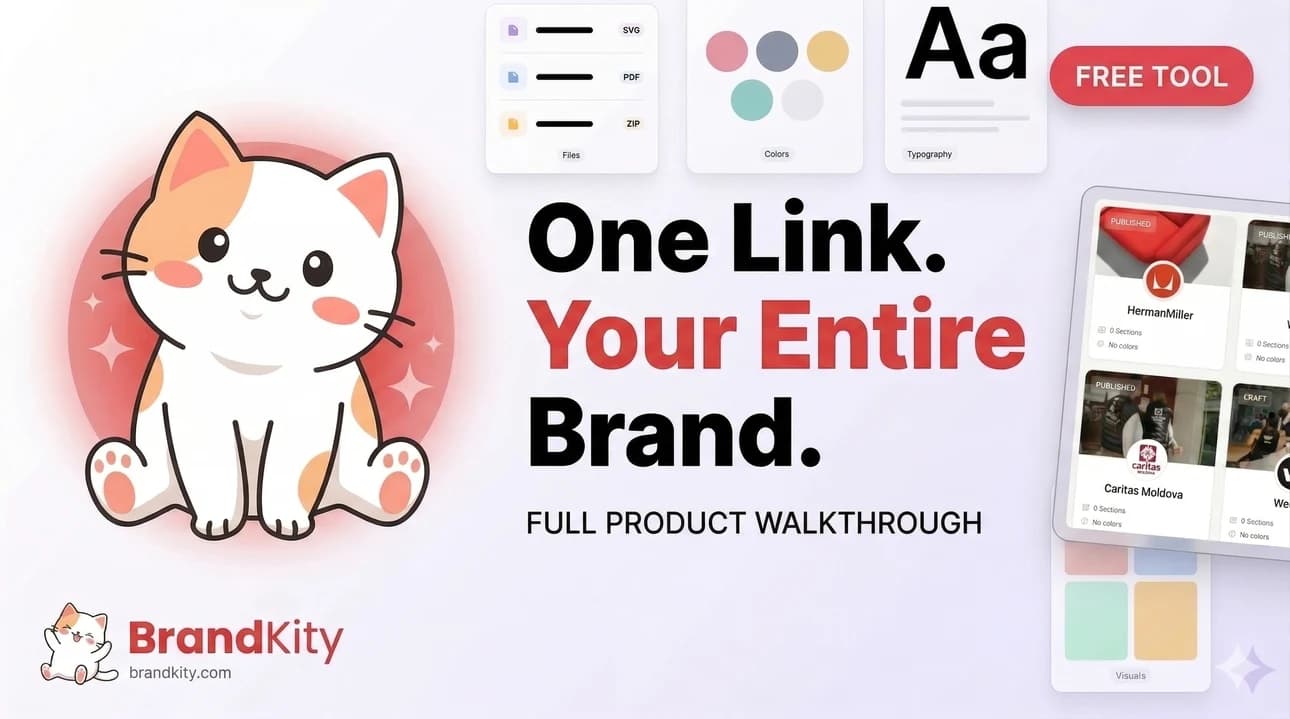
Table of contents
- Stop the Asset Scramble: The Foundation of a Flawless Brand Handoff
- Defining Your Client’s Brand Ecosystem: Beyond Just Logos
- The Anatomy of an Organized Asset Library
- Crafting Your Brand’s Visual Language: Guidelines That Empower
- From Chaos to Clarity: Structuring Your Deliverables
- The Power of a Centralized Delivery Hub (The ‘One Link’ Concept)
- Organizing Assets by Use Case (Web, Print, Social Media)
- Including Usage Rights and Licensing Information
- The Handoff Meeting: Setting Expectations and Guiding Your Client
- Pre-Handoff Checklist for Designers
- Key Talking Points During the Delivery Session
- Anticipating Common Client Questions and Misconceptions
- Ensuring Accessibility: Making Assets Easy for Everyone to Use
- Font Accessibility: Licensing and Embedding Considerations
- Color Contrast and Accessibility Standards
- Providing Assets in Multiple Formats for Diverse Needs
- Post-Handoff Support: Building Lasting Client Relationships
- Strategies for Handling Future Asset Requests
- Keeping Your Client’s Brand Assets Up-to-Date
- Gathering Feedback for Workflow Improvement
- Leveraging Technology for Seamless Brand Asset Delivery in 2026
- Why Dedicated Platforms Streamline the Process
- Features to Look for in a Brand Asset Delivery Solution
- The ROI of Investing in an Efficient Workflow
- Common Pitfalls to Avoid in Your Branding Workflow
- The Danger of ‘Just Sending a Zip File’
- Ignoring Client Skill Levels and Technical Capabilities
- Over-complicating the Delivery Process
Delivering brand assets to clients can feel like an endless game of digital scavenger hunt. Scattered files, outdated versions, and a lack of clarity often lead to frustration for both designers and clients. This disorganization doesn’t just create administrative headaches; it actively undermines the professional image you strive to build.
A streamlined and professional brand asset delivery process is more than just good practice; it’s a crucial component of a successful client relationship and a testament to your agency’s efficiency. By implementing a robust workflow, you ensure your hard work is presented impeccably, fostering trust and setting the stage for future collaborations.
Stop the Asset Scramble: The Foundation of a Flawless Brand Handoff
The chaos of disorganized brand assets is a pervasive problem in the creative industry. It often stems from a lack of foresight, where the immediate task of creation overshadows the critical phase of organized delivery. This can manifest in numerous ways, leading to significant inefficiencies and client dissatisfaction. Understanding these pain points is the first step toward building a better system. When files are not logically structured, searching for specific logos, color codes, or font families becomes a time-consuming and often fruitless endeavor. This impacts not only the immediate project but also any future requests or updates. A disorganized asset library directly translates to wasted hours, which in turn affects profitability and the perceived value of your services. This is especially true in today’s fast-paced digital landscape where rapid access to consistent brand materials is paramount for marketing and communication efforts.
The modern client expects a polished, professional, and effortlessly accessible package of their brand assets. In 2026, relying on ad-hoc file sharing methods like email attachments or generic cloud storage links is no longer acceptable. Clients need a single source of truth that is intuitive and easy to navigate, allowing their internal teams or external partners to quickly find and utilize brand elements correctly. A structured workflow ensures consistency across all brand applications, preventing off-brand usage that can dilute brand identity. This structured approach not only simplifies the client’s life but also protects your agency’s reputation by guaranteeing that the brand is presented as intended. For agencies, this efficiency translates to quicker project closures and fewer support requests, allowing teams to focus on new creative challenges rather than managing past deliverables.
At its core, a professional brand delivery is built on a foundation of organization, clarity, and accessibility. This involves not just the final assets themselves but also the process by which they are curated, stored, and presented. The key components include a comprehensive inventory of all brand elements, clear categorization, and standardized file formats that cater to diverse usage needs. This structured approach ensures that clients receive everything they need in a format they can easily use, from web graphics to print materials. A well-defined workflow also incorporates essential documentation, such as brand guidelines, which serve as a user manual for the brand’s visual identity. This level of detail demonstrates a commitment to the client’s long-term brand success and reinforces the professionalism of your service. Embracing a systematic approach can significantly reduce the friction in the client handoff process, making it a smooth and positive experience.
Defining Your Client’s Brand Ecosystem: Beyond Just Logos
A brand’s ecosystem extends far beyond its primary logo. To deliver truly professional assets, designers must understand and meticulously catalog every visual element that contributes to a brand’s identity. This includes core graphic assets like logos in various formats (vector, raster, different color variations), a defined color palette with precise specifications (HEX, RGB, CMYK, Pantone), and typography guidelines detailing primary and secondary fonts with their intended weights and usage. Beyond these essentials, consider elements like icons, patterns, and graphic elements that contribute to the brand’s unique visual language. Thoroughly documenting these core components ensures that clients have the building blocks for consistent brand application across all their communication channels. This detailed approach prevents misinterpretations and ensures that the brand maintains its integrity, whether it’s being applied to a social media post or a large-format print advertisement. Understanding the full scope of these elements is critical for a complete and useful brand asset delivery.
Beyond the foundational elements, many brands possess unique visual assets that are critical to their distinctiveness. These can include custom illustrations, bespoke icon sets, distinctive patterns or textures, and even unique photography styles or graphical treatments. For instance, a tech company might have a proprietary set of minimalist icons that are integral to their app interface, or a food brand might have a specific illustration style that evokes warmth and approachability. Identifying and providing these assets in their appropriate formats is just as important as delivering the logo. These unique assets often encapsulate the brand’s personality and differentiating factors. Without them, clients may struggle to replicate the full visual experience, leading to a diluted brand presence. A comprehensive delivery ensures that clients can leverage these specific elements to reinforce their brand’s unique character.
The choice of file formats is a crucial, often overlooked, aspect of brand asset delivery. Different applications require different file types to ensure optimal quality and usability. For logos and vector graphics, providing Scalable Vector Graphics (SVG) is paramount, as they can be resized infinitely without loss of quality, making them ideal for web and print. Also essential are raster formats like PNG (with transparency for web use) and JPG (for general imagery). For print collateral, clients will need CMYK versions of logos and color palettes, often in formats like AI or EPS. Providing font files (ensuring proper licensing is communicated) or links to where they can be acquired is also necessary. Understanding the diverse needs of clients—from web developers to print shops—allows you to anticipate their requirements and deliver a versatile package. This foresight minimizes follow-up requests and positions you as a highly professional and resourceful partner. For a deeper dive into managing these aspects, exploring resources on organizing design assets for clients can provide valuable insights.
The Anatomy of an Organized Asset Library
Creating a robust and easily navigable asset library requires more than just dumping files into folders. The cornerstone of an organized system is the implementation of clear and consistent naming conventions for both files and folders. This means establishing a logical hierarchy and a predictable naming structure that allows anyone to quickly locate a specific asset. For example, a logo might be named `ClientNameLogoPrimaryFullColorRGB.svg`, and a color swatch folder could be `ClientNameBrandColorsCMYK`. This systematic approach eliminates ambiguity and saves invaluable time. Beyond naming, folder structures should be intuitive, perhaps organized by asset type (Logos, Colors, Fonts, Imagery) or by project phase if applicable. A well-structured library not only benefits the client but also streamlines internal workflows, making it easier for your team to access and manage assets.
In the dynamic world of design, projects evolve, and assets are updated. To avoid confusion and ensure clients are always using the latest approved versions, implementing effective version control is non-negotiable. This involves clearly marking files with version numbers (e.g., `ClientNameLogov2.1.ai`) and maintaining a history of previous iterations. When delivering assets, it’s crucial to provide the final, approved versions while also potentially archiving older ones for reference. This practice is particularly important for projects that involve multiple rounds of revisions or where different design directions were explored. By clearly indicating which version is current and which are superseded, you prevent clients from accidentally using outdated materials, which can lead to inconsistencies in their branding and potential rework. This meticulous attention to detail reinforces your agency’s professionalism and commitment to quality.
Color is a fundamental element of brand identity, and its accurate representation across various media is critical. Best practices for color palettes involve providing specifications for each primary and secondary color in multiple formats. This includes HEX codes for digital applications, RGB values for screen-based displays, and CMYK values for print production. For professional print work, including Pantone (PMS) equivalents is often essential for precise color matching. When delivering these, ensure they are clearly labeled and easily accessible, perhaps within a dedicated color guide document or directly in the asset library. Providing color swatches in common design software formats (like ASE files for Adobe applications) can further simplify usage for designers. The goal is to ensure that the brand’s colors appear consistently and accurately, regardless of where or how they are used, upholding the integrity of the brand’s visual identity.
Crafting Your Brand’s Visual Language: Guidelines That Empower
Effective brand guidelines are more than just a document; they are the blueprint for a consistent and impactful brand presence. They translate the abstract essence of a brand into tangible rules and recommendations for its visual application. Key elements to include are a clear articulation of the brand’s mission and values, which provides context for the visual choices. This is followed by detailed sections on logo usage, specifying clear space, minimum sizes, and prohibitions against misuse. Comprehensive color palettes with their respective codes (HEX, RGB, CMYK, Pantone) are essential, as are typography guidelines that define primary and secondary fonts, weights, and hierarchies. Including guidance on imagery style, tone of voice, and approved graphic elements further solidifies the brand’s identity. These guidelines serve as the ultimate reference for anyone interacting with the brand’s visual elements, ensuring uniformity across all touchpoints. They are a critical tool for maintaining brand integrity and professionalism.
A common pitfall with brand guidelines is making them overly technical or complex, rendering them inaccessible to non-designers who will inevitably use them. The most effective guidelines strike a balance between comprehensive detail and user-friendly clarity. This means using clear, concise language and employing visual examples extensively. Instead of just stating rules, show them. For instance, use visual callouts to demonstrate correct logo placement versus incorrect usage. Organize the information logically with a clear table of contents and an index for easy navigation. Consider creating different versions or summaries tailored to specific audiences, such as a condensed version for marketing teams or a simplified overview for general employees. The ultimate goal is to empower anyone who needs to use the brand assets to do so confidently and correctly, without needing a design background. This democratizes brand consistency.
To illustrate, consider a mini checklist for essential brand guidelines that can be provided to clients:
- Logo Usage: Primary logo, secondary logos, acceptable variations, minimum size, clear space requirements, and common misuses to avoid.
- Color Palette: Primary and secondary brand colors with HEX, RGB, and CMYK values clearly listed.
- Typography: Brand fonts for headings, body text, and other applications, including recommended weights and sizes.
- Imagery Style: Examples of photography and illustration that align with the brand’s tone and aesthetic.
This concise framework provides immediate clarity on the most critical brand elements. For instance, a hypothetical startup called “NovaTech” might have a clean, minimalist logo, a vibrant blue primary color (HEX #007bff), and a modern sans-serif font like “Inter” for all communications. By providing these key points upfront, clients gain an immediate understanding of how to represent NovaTech visually, ensuring consistency from day one. This approach simplifies the complex task of brand management for clients and reinforces the structured delivery process.
From Chaos to Clarity: Structuring Your Deliverables
Delivering brand assets can easily devolve into a messy exchange of files across emails, cloud storage links, and chat messages. A structured approach transforms this potential chaos into a clear, professional handover. This involves more than just sending files; it’s about curating them in a way that empowers your client to use them effectively and consistently. The goal is to move beyond a simple dump of assets to a thoughtfully organized toolkit that reflects the care and strategic thinking invested in the brand.
A well-structured deliverable package not only demonstrates your professionalism but also significantly reduces the likelihood of misinterpretation or misuse of brand elements. Clients who receive organized assets are more likely to maintain brand integrity, leading to a stronger, more cohesive brand presence for them. This clarity upfront saves time and potential headaches for both parties down the line, fostering a more positive and collaborative relationship. Think of it as the final, polished presentation of your creative work, ensuring its longevity and impact.
The Power of a Centralized Delivery Hub (The ‘One Link’ Concept)
The most effective way to combat scattered files and client confusion is through a centralized delivery hub. This concept, often referred to as the ‘one link’ approach, consolidates all necessary brand assets into a single, easily accessible online location. Instead of clients digging through email threads or multiple cloud folders, they receive one URL that serves as their comprehensive brand toolkit. This not only simplifies the delivery process for you but dramatically enhances the client’s experience, providing immediate clarity and control over their brand assets. This approach directly addresses the pain point of fragmented digital assets, ensuring consistency and ease of access.
A well-executed ‘one link’ solution should be more than just a folder; it should be an intuitive interface that categorizes assets logically. This might include sections for logos (in various formats like SVG, PNG, JPG), color palettes (with HEX, RGB, CMYK values), typography (font files and licensing details), imagery, and any other brand collateral. Such a hub acts as a single source of truth, empowering clients to quickly find what they need without needing to ask for clarification. Platforms dedicated to this purpose, like BrandKity, are designed to facilitate this streamlined process, making it effortless to manage and share these crucial elements. This organizational strategy is key to a professional brand handover, as detailed in our guide on simplifying brand delivery.
Organizing Assets by Use Case (Web, Print, Social Media)
To maximize the utility of your brand asset delivery, organizing files by their intended use case is paramount. Clients often struggle with knowing which file format or version is appropriate for different applications. Clearly separating assets for web, print, and social media ensures they use the correct specifications, preventing common issues like pixelation on large print materials or incorrect color profiles in digital applications. For example, web assets typically require RGB color modes and optimized file sizes (like PNG or JPG), while print demands CMYK and often higher resolution formats (like EPS or high-res PDF).
Categorizing by use case also means providing the right variations of logos and other graphics. A social media logo might need to be a simplified, square version, whereas a print logo might require a more detailed, full-color rendition. This foresight saves clients time and prevents them from having to re-request or adapt assets themselves. By proactively providing these tailored sets, you demonstrate a deep understanding of their ongoing needs. This meticulous organization can prevent costly errors and ensure brand consistency across all touchpoints, acting as a vital component of your overall client’s toolkit.
Including Usage Rights and Licensing Information
Beyond providing the files themselves, it is crucial to include comprehensive information regarding usage rights and licensing. This section of your deliverable acts as a legal and practical guide, ensuring your client understands how they are permitted to use each asset. Clear documentation prevents accidental infringement and protects both your work and the client. This could involve details about the software licenses for fonts, stock imagery licenses, or specific restrictions on logo usage (e.g., not altering colors, minimum size requirements).
Failure to clearly outline these terms can lead to significant disputes or costly legal issues down the line. For instance, using a font for commercial print advertising without the proper license can result in hefty fines. Providing this information upfront, perhaps in a dedicated document or within the asset hub itself, fosters transparency and builds trust. It shows that you are not just delivering creative assets, but also the critical context for their responsible and effective deployment. This diligence is a hallmark of professional brand asset management, contributing to a secure and compliant brand implementation for your client. It’s an essential part of the professional workflow.
The Handoff Meeting: Setting Expectations and Guiding Your Client
The culmination of your design work isn’t just the delivery of files; it’s the strategic handoff process. A dedicated handoff meeting transforms a passive file transfer into an active, educational session. This meeting is your opportunity to not only present the final assets but also to guide your client on their proper usage, answer questions, and set clear expectations for future brand stewardship. It’s a critical step that ensures the brand’s integrity is maintained long after your project concludes. This proactive engagement is what separates a professional agency from a freelancer simply delivering files.
By conducting a thorough handoff, you empower your client with the knowledge and confidence to manage their brand effectively. This reduces the likelihood of misinterpretations, brand dilution, or the need for repeated support requests. A well-prepared meeting demonstrates your commitment to the client’s long-term success and reinforces the value of your expertise. Think of it as the final flourish in your service, ensuring the brand foundation you’ve built can be effectively built upon by the client, establishing a strong basis for ongoing brand consistency and impact.
Pre-Handoff Checklist for Designers
Before the client handoff meeting, rigorous preparation is key to a smooth and professional experience. A comprehensive pre-handoff checklist ensures that all necessary assets are prepared, correctly formatted, and thoroughly reviewed. This includes verifying that all final logo variations (vector, raster, color options, file types like SVG, AI, EPS, PNG, JPG) are present and organized. Ensure all brand guideline documents are up-to-date, clearly detailing logo usage, color palettes (with CMYK, RGB, HEX, Pantone values), typography specifications, and imagery style. Confirm that any font files included are properly licensed for client use and that embedding permissions are set correctly if applicable.
Additionally, double-check that all provided visual assets, such as icons, illustrations, or photography, are of the highest quality and meet the project’s requirements. Test all links to the centralized delivery hub or cloud storage to confirm they are active and accessible to the client. A crucial step often overlooked is reviewing the project scope and deliverables one last time to ensure nothing has been missed. Preparing a concise presentation deck summarizing the brand’s core elements and the delivered assets can also significantly enhance the meeting’s effectiveness. This attention to detail not only prevents potential issues but also showcases your professionalism and commitment to delivering a complete, high-quality package, aligning with principles of ace brand delivery for designers.
Key Talking Points During the Delivery Session
During the handoff meeting, focus on several key talking points to ensure your client fully understands and values the delivered assets. Begin by reiterating the project’s strategic goals and how the final assets directly support them. This reinforces the value of your work. Next, walk them through the centralized asset hub, demonstrating its structure, navigation, and how to access different file types and formats. Explain the rationale behind specific asset choices, such as why certain logo variations are provided or why particular file formats are best suited for web versus print.
Crucially, address usage rights and licensing clearly. Detail any restrictions or permissions associated with fonts, imagery, or logos to prevent misuse. If brand guidelines were created, meticulously review them, highlighting key principles and best practices for maintaining brand consistency. Explain how to apply brand elements across various platforms and media, offering practical examples. Finally, set expectations for ongoing support, clarifying what is included and how future requests will be handled. This structured conversation ensures the client feels empowered and confident in their ability to manage and utilize the brand assets effectively, avoiding confusion and misuse. This comprehensive approach ensures the client can effectively leverage the brand assets, a key component of successful streamlining brand assets.
Anticipating Common Client Questions and Misconceptions
Proactive anticipation of client questions and misconceptions is vital for a successful handoff. Clients may not have a deep technical understanding of file formats. For instance, they might ask why a logo looks blurry on their screen, which is often due to viewing a low-resolution JPG instead of a scalable vector format like SVG. Be prepared to explain the difference between raster and vector graphics and demonstrate how to select the appropriate file type. Another common misconception relates to color: clients might question why a color looks different on their screen versus in print, prompting an explanation of RGB versus CMYK color modes.
Clients may also be unclear about font licensing. It’s essential to preemptively explain that font files themselves are typically licensed software, not assets to be freely distributed or embedded without proper permission. Clarify whether they have received desktop licenses for installation or web licenses for online use. Questions about editing assets are also frequent; prepare to explain what modifications are permissible according to the brand guidelines and which actions could compromise brand integrity. Addressing these points before they become issues demonstrates your expertise and builds client confidence, ensuring they feel supported and knowledgeable about managing their new brand assets. This preparation is key to preventing future issues and maintaining brand consistency across all platforms.
Ensuring Accessibility: Making Assets Easy for Everyone to Use
Delivering brand assets isn’t solely about aesthetics and technical specifications; it’s increasingly about ensuring accessibility for a wide range of users and contexts. Accessible design means creating assets that can be perceived, understood, operated, and interacted with by all people, including those with disabilities. This involves considerations far beyond standard design practices, touching on aspects like font choices, color usage, and file formats. By integrating accessibility into your asset delivery, you not only comply with evolving standards but also broaden the reach and impact of your client’s brand.
Making assets accessible is not an optional add-on; it’s a fundamental aspect of responsible and inclusive design. When assets are designed with accessibility in mind from the outset, they benefit everyone, not just users with disabilities. For example, clear color contrast improves readability for people with low vision and also makes content easier to view in bright sunlight. Providing assets in multiple formats ensures they can be utilized by various platforms and assistive technologies. This holistic approach to asset delivery elevates your service and provides significant value to your clients by ensuring their brand is inclusive and widely usable.
Font Accessibility: Licensing and Embedding Considerations
Font choices have a significant impact on both the aesthetic appeal and the accessibility of brand materials. When selecting fonts, designers should consider readability for users with visual impairments or cognitive differences, opting for clear, legible letterforms over overly stylized or decorative ones. Beyond design, licensing is a critical factor. Ensure that the fonts provided for client use have appropriate licenses that cover their intended applications, whether for desktop use, web embedding, or app distribution. Some font licenses restrict embedding in certain file types or require additional fees for broader usage.
For instance, if a client needs to embed a font in a PDF document intended for public distribution, the font’s license must permit this. Similarly, web fonts require specific licenses for embedding on websites. When delivering font files, it’s best practice to include clear documentation of the licenses, specifying what is permitted and what is not. Providing font files in formats that support embedding (like WOFF2 for web) and ensuring these permissions are granted is crucial for web accessibility. This meticulous attention to font licensing and embedding capabilities ensures clients can use typography effectively and legally across all platforms, maintaining both brand integrity and compliance.
Color Contrast and Accessibility Standards
Color contrast is a cornerstone of web and document accessibility, directly impacting how easily users can perceive and read content. The Web Content Accessibility Guidelines (WCAG) provide specific standards for color contrast ratios. For normal text (under 18pt or 24px), a contrast ratio of at least 4.5:1 is recommended, while large text (18pt or 24px and up) requires a minimum ratio of 3:1. Failing to meet these standards can render text virtually unreadable for individuals with low vision or color blindness, excluding a significant portion of the audience.
When delivering brand assets, especially those involving color palettes or UI elements, designers must ensure compliance. This involves providing a color palette that includes sufficient contrast options and clearly labeling which combinations meet WCAG standards. Tools exist to check contrast ratios automatically, and these should be utilized during the design and review process. By actively ensuring good color contrast, you not only meet accessibility requirements but also create a more visually comfortable and legible experience for all users, enhancing the overall usability and inclusivity of the brand’s visual identity. This attention to detail contributes to a professional and ethically designed brand, as seen in best practices for design systems.
Providing Assets in Multiple Formats for Diverse Needs
To truly ensure your brand assets are usable by everyone, in every context, providing them in multiple formats is essential. Different platforms, software, and user needs demand flexibility. For instance, logos should be provided as vector files (SVG, AI, EPS) for scalability without quality loss, and as raster files (PNG, JPG) optimized for web and specific applications. PNGs are crucial for transparent backgrounds, a frequent requirement across digital media.
Consider also providing assets in accessible formats. For documents, this means offering not just PDFs, but potentially tagged PDFs that work with screen readers, or even structured HTML versions where appropriate. Icon libraries might benefit from inclusion in font-based formats (like Font Awesome) as well as SVG, allowing for easier scaling and color manipulation by developers. When delivering visual assets like illustrations or photographs, offer them in various resolutions and file types suitable for both high-quality print and optimized web use. This layered approach to asset delivery ensures that no matter the client’s technical capability or the intended platform, they have the right tool for the job, promoting wider adoption and consistent brand representation.
Post-Handoff Support: Building Lasting Client Relationships
The delivery of assets is not the end of the design process; it’s the beginning of a lasting client relationship. Effective post-handoff support is crucial for client satisfaction, retention, and generating future business. This phase involves being available to answer questions, provide guidance, and ensure the client feels confident in managing their new brand assets. It’s about nurturing the relationship by demonstrating continued value and commitment to their brand’s success. This proactive engagement solidifies your role as a trusted partner rather than just a service provider.
By offering ongoing support, you help clients avoid common pitfalls that can arise when implementing new branding. This might include assisting with minor adjustments, clarifying usage guidelines, or helping them integrate assets into new marketing materials. Demonstrating reliability and responsiveness during this critical period builds immense goodwill. It positions your agency or studio as a long-term resource, making clients more likely to return for future projects and recommend your services to others. This commitment to post-handoff care is a cornerstone of building a sustainable and reputable design business.
Strategies for Handling Future Asset Requests
Managing future asset requests efficiently is key to maintaining client satisfaction and your own operational sanity. Establish clear protocols for how such requests should be submitted, perhaps through a dedicated support portal, email, or a brief intake form. This ensures you gather all necessary information upfront, such as the specific asset needed, its intended use, and any required modifications. For simple requests, like providing a logo in a different file format or size, having a streamlined process can make these tasks quick and low-effort.
For more complex requests that might fall outside the original scope, it’s important to have a policy for assessing whether they constitute a new project, require a separate fee, or can be handled as part of a retainer agreement. Clearly communicating these terms to your client during the initial handoff meeting sets expectations and prevents misunderstandings. Utilizing a platform that simplifies asset organization and retrieval, such as the one described in brand assets delivered via one link, can significantly speed up responses to common requests, as much of the groundwork is already laid.
Keeping Your Client’s Brand Assets Up-to-Date
Brands are not static; they evolve. A critical aspect of post-handoff support is helping clients understand the need for and process of keeping their brand assets current. As a client’s business grows or market trends shift, their branding may require updates. This could range from minor tweaks, like adjusting a color palette to reflect new product lines, to more significant overhauls. Your role can involve periodic reviews or establishing a system for clients to flag when they believe an update might be necessary.
Proactively reaching out to clients for a brand health check—perhaps annually—can be an excellent strategy. This allows you to assess the current relevance and effectiveness of their visual identity and identify opportunities for improvement. By staying engaged, you can guide them through necessary refreshes, ensuring their brand remains strong and competitive. Offering services for these updates, whether as standalone projects or part of a retainer, provides ongoing value and revenue streams while ensuring the client’s brand assets remain robust and aligned with their business objectives. This foresight helps maintain brand relevance and effectiveness.
Gathering Feedback for Workflow Improvement
Continuous improvement is vital in any professional service, and gathering feedback from clients after asset delivery is an invaluable part of this process. Encourage clients to share their experience with the delivery workflow, the accessibility of the assets, and their overall satisfaction. This feedback can highlight areas where your process is excelling and areas that may need refinement. Implementing a short, focused feedback survey post-handoff can yield honest insights without being overly burdensome for the client.
Pay close attention to feedback regarding the clarity of asset organization, the ease of accessing files, and the helpfulness of any accompanying documentation or guidance. Constructive criticism can reveal potential usability issues or miscommunications that might not have been apparent otherwise. Acting on this feedback—whether it’s refining your file naming conventions, improving the structure of your delivery hub, or enhancing your explanation of licensing—demonstrates your commitment to providing the best possible service. This iterative approach ensures your brand asset delivery process remains efficient, professional, and tailored to meet client needs, forming a key part of your agency’s success.
Leveraging Technology for Seamless Brand Asset Delivery in 2026
In today’s fast-paced digital landscape, the professional delivery of brand assets is no longer a secondary concern; it’s a core component of a successful branding strategy. As we navigate 2026, the tools and technologies available empower designers and agencies to move beyond ad-hoc file sharing and embrace truly streamlined workflows. This shift ensures clients receive their brand identity elements in a structured, accessible, and easily usable format, fostering confidence and reducing post-delivery friction. The right technological approach not only simplifies the handover but also reinforces the value and professionalism of the work delivered, setting a positive tone for ongoing client relationships and future projects. Embracing these advancements is crucial for maintaining a competitive edge and exceeding client expectations in an increasingly demanding market.
Why Dedicated Platforms Streamline the Process
The traditional method of sending brand assets often involves a chaotic mix of email attachments, cloud storage links, and fragmented communication. This can lead to confusion, version control issues, and significant time wasted by both the agency and the client in locating the correct files. Dedicated brand asset delivery platforms, such as BrandKity, offer a centralized hub where all brand elements—logos in various formats, color swatches, typography guidelines, imagery, and even presentation templates—can be stored, organized, and shared. This consolidation provides a single source of truth, ensuring that everyone involved is working with the most up-to-date assets. It eliminates the guesswork associated with finding specific files and significantly reduces the likelihood of outdated or incorrect assets being used, which can damage brand consistency. A well-structured delivery also reflects positively on the agency’s professionalism and attention to detail, which can be a deciding factor for clients when choosing partners or extending contracts. By centralizing these critical components, these platforms pave the way for more efficient collaboration and a smoother brand adoption process for the client.
Features to Look for in a Brand Asset Delivery Solution
When selecting a platform to manage and deliver your brand assets, several key features can elevate your workflow. Firstly, intuitive organization and categorization are paramount; the ability to easily group assets by type (logos, fonts, icons), file format (SVG, PNG, JPG), or project phase is essential. Look for robust version control capabilities to ensure clients always access the latest iterations. Advanced search functionality allows for quick retrieval of specific assets, saving valuable time. Customizable branding on the delivery portal itself—such as adding client logos or custom color schemes—enhances the professional touch. Security features, including password protection and controlled access, are critical for safeguarding proprietary brand information. Integration capabilities with other design tools or project management software can further streamline workflows. Finally, detailed analytics on asset downloads and usage can provide valuable insights into how clients are interacting with the brand materials. A platform that offers a clear, one-link sharing option, as emphasized by BrandKity, directly addresses the need for simplicity and accessibility, making it easier for clients to get what they need without navigating complex interfaces. This focus on user experience for the recipient is often overlooked but is crucial for a successful handover.
The ROI of Investing in an Efficient Workflow
Investing in a dedicated brand asset delivery platform yields significant returns that extend beyond mere convenience. By reducing the time spent on repetitive tasks like searching for files, resending assets, or answering basic queries about file formats, agencies can reclaim valuable hours. This reclaimed time can be reallocated to more strategic, revenue-generating activities or creative endeavors. For instance, an agency that previously spent 5 hours per week managing asset delivery might save up to 260 hours annually by implementing an efficient system. This translates directly into increased productivity and profitability. Furthermore, a professional and organized asset handover minimizes errors and misinterpretations, leading to fewer client revisions and complaints related to asset usage. This not only saves time and resources but also boosts client satisfaction and loyalty, potentially leading to repeat business and positive referrals. A study by [hypothetical industry research firm] found that agencies using structured brand delivery workflows reported a 20% increase in client retention rates and a 15% reduction in project delays attributed to asset management issues. Ultimately, the investment in a robust delivery system is an investment in operational efficiency, client happiness, and sustainable business growth. This is crucial for agencies aiming to scale and maintain a competitive advantage.
Common Pitfalls to Avoid in Your Branding Workflow
While the goal is always a seamless brand asset delivery, several common mistakes can derail even the best intentions. Understanding these pitfalls is the first step toward preventing them and ensuring your client handoff is as professional and effective as possible. These errors often stem from a lack of foresight regarding the client’s perspective, technical capabilities, or the inherent complexities of digital file management. Overlooking these aspects can lead to frustration, wasted time, and a tarnished professional image, undermining the hard work invested in the branding project itself. Proactive planning and a client-centric approach are key to navigating these challenges successfully. Recognizing these potential issues allows for the implementation of preventative measures that safeguard the integrity of the brand and the client relationship.
The Danger of ‘Just Sending a Zip File’
The seemingly simple act of compressing all brand assets into a single ZIP file is a pervasive habit that often causes more problems than it solves. While it might appear efficient for the sender, it presents significant challenges for the recipient. Clients, especially those with limited technical expertise, may struggle to extract the files correctly, leading to incomplete or corrupted downloads. Moreover, a ZIP file offers no context; there are no embedded guidelines, no clear descriptions of file types or their intended uses, and no easy way to preview assets before downloading. This lack of organization can result in the wrong file versions being used, leading to brand inconsistency and costly revisions. Imagine a client needing a specific logo format for a small social media icon but having to sift through dozens of files, potentially using a high-resolution print version that becomes pixelated. Platforms that offer a structured, link-based delivery, such as those discussed in how to stop asset chaos with one link delivery, eliminate this issue by presenting assets in an easily navigable and previewable format. This approach ensures clients can quickly find and utilize the exact asset they need, in the correct format, for any given application, significantly reducing errors and improving brand integrity.
Ignoring Client Skill Levels and Technical Capabilities
A critical oversight in many branding workflows is failing to account for the client’s technical proficiency and familiarity with design software or file management. What seems straightforward to a designer—like differentiating between AI, EPS, and SVG formats—can be an overwhelming mystery to a marketing manager or a small business owner. Sending a dense folder of technically specific files without clear instructions or context is a recipe for confusion and misuse. For instance, providing only vector files like AI or EPS to a client who primarily works with basic office software will render them unusable. A truly professional delivery process anticipates these differences. This means providing assets in widely compatible formats (like PNG, JPG, or PDF) alongside the native design files, and crucially, offering a clear explanation of each asset’s purpose and recommended usage. Educational resources or a simple guide embedded within the delivery platform can be invaluable. Solutions that allow for easy previewing and downloading of various formats, catering to different needs, are essential. This client-centric approach ensures that regardless of their technical background, clients can confidently and correctly implement the brand assets, fostering a positive experience and reinforcing the designer’s role as a strategic partner.
Over-complicating the Delivery Process
Conversely, some workflows become overly complex, making the delivery process cumbersome for both the agency and the client. This might involve requiring clients to download multiple packages, navigate through intricate folder structures, or use specialized software to access the assets. The goal of brand asset delivery should be simplicity and accessibility, enabling clients to quickly integrate the assets into their marketing and operational efforts. Over-complication often arises from an internal agency process that prioritizes a granular level of organization understandable only to designers, rather than a user-friendly experience for the end-user. For example, a client might receive separate downloads for every single logo variation, color palette hex code, and font file, instead of a consolidated, logically grouped collection. This can lead to decision fatigue and a feeling of being overwhelmed, negating the positive impact of the branding work. Effective solutions, like the one-link approach advocated by BrandKity, streamline this by providing a single, clean interface where all necessary assets are logically presented and readily available. This ensures clients can easily find, understand, and use the brand elements without unnecessary hurdles, ultimately enhancing the perceived value of the delivered brand and fostering smoother adoption. This principle is central to achieving client satisfaction and minimizing post-delivery support.
Saurabh Kumar
Founder, BrandKity
Saurabh writes about practical brand systems, faster client handoffs, and scalable workflows for designers and agencies building repeatable delivery operations.
Connect on LinkedIn