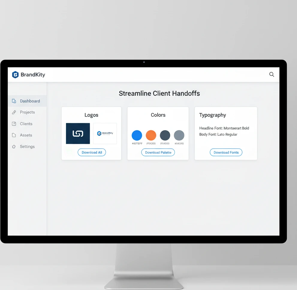
Streamline Client Handoffs: The BrandKity Way
The final stages of any client project often involve handing over a treasure trove of creative assets. Yet, for many designers and agencies, this crit…

Table of contents
- The Chaos of Scattered Brand Assets: Why Your Client Handoffs Need an Upgrade
- The Modern Client Handoff: Beyond a Zip File
- One Link to Rule Them All: Introducing the Power of a Centralized Brand Hub
- What is a Brand Hub and Why Does it Matter in 2026?
- The ‘One Link’ Advantage: Eliminating Client Confusion
- Key Components of a Professional Brand Asset Delivery
- Structuring Your Brand Assets for Clarity and Usability
- Organizing Logo Files: From Vector to Raster, Master and Variations
- Font Libraries: Ensuring Consistent Typography Across All Platforms
- Color Palettes: Specifying CMYK, RGB, HEX, and More
- Visual Assets: Images, Icons, and Illustrations Made Easy
- Beyond Files: What Your Brand Handoff Needs to Include
- Essential Brand Guideline Elements Every Client Needs
- Usage Do’s and Don’ts for Critical Brand Elements
- Providing Context and Explanation for Each Asset Category
- Simplifying the Process: How BrandKity Streamlines Delivery
- Intuitive Platform for Asset Upload and Organization
- Customizable Brand Hubs Tailored to Your Clients
- Secure and Professional Link Sharing
- Common Pitfalls in Client Handoffs and How to Avoid Them
- The Trap of Unorganized Folders and Generic File Names
- Over-reliance on Email Attachments and Cloud Storage Links
- Client Frustration from Missing Assets or Incorrect Versions
- Boosting Client Satisfaction and Building Stronger Relationships
- Perception of Professionalism and Attention to Detail
- Empowering Clients to Use Brand Assets Correctly
- Reducing Follow-Up Questions and Repeated Asset Requests
- Integrating Brand Delivery into Your Agency Workflow
- Streamlining Onboarding for New Clients
- Efficient Handoffs for Design System Components
- Saving Time for Your Design and Account Management Teams
- The BrandKity Workflow: A Step-by-Step Example
- From Project Completion to Shareable Link
- Client Accessing and Downloading Assets
- Ongoing Brand Asset Management and Updates
- Investing in Your Brand’s Future: The Long-Term Benefits of a Robust Handoff
The final stages of any client project often involve handing over a treasure trove of creative assets. Yet, for many designers and agencies, this critical moment can devolve into a disorganized, time-consuming ordeal. Scattered files across cloud storage, emails stuffed with forgotten attachments, and the dreaded “Where’s that logo file?” ping from a client – these are hallmarks of an inefficient brand asset delivery process.
In today’s fast-paced digital landscape, a professional and streamlined client handoff isn’t just a nicety; it’s a fundamental requirement for client satisfaction and maintaining your agency’s reputation. Let’s explore how to transform this often-frustrating process into a seamless experience.
The Chaos of Scattered Brand Assets: Why Your Client Handoffs Need an Upgrade
Imagine a client launching a new marketing campaign and struggling to find the correct version of their logo, or a developer needing specific color codes that are buried in a lengthy PDF. This is the reality for businesses that receive brand assets in a haphazard fashion. Common culprits include delivering files via multiple email threads, unorganized cloud storage folders, or even physical drives that can become outdated or lost. This lack of centralized organization leads to frustration for both the client and your team. Clients may inadvertently use incorrect assets, leading to brand inconsistencies and a diluted brand identity. Your team, in turn, spends valuable time answering repetitive requests for specific files or correcting mistakes born from miscommunication. A study by [Authoritative Source on Brand Management] found that 65% of brand identity issues stem from poor asset management during handoff and subsequent use. This disorganization directly impacts brand perception and can hinder a client’s ability to leverage their new brand effectively in the market, ultimately diminishing the impact of your hard work.

The consequences extend beyond minor inconveniences. When clients can’t easily access and use brand assets correctly, it can lead to expensive rework and damage to their brand’s credibility. For instance, a small business using a low-resolution JPEG of their logo for large-scale signage will result in a pixelated, unprofessional appearance. Similarly, developers working with incorrect color values can lead to inconsistent branding across digital platforms. This scenario often forces design teams to revisit past projects, wasting billable hours and straining client relationships. The initial effort to establish a clear, structured delivery system upfront pays dividends by preventing these downstream problems, ensuring the client can confidently deploy their brand assets across all touchpoints without further support.
The Modern Client Handoff: Beyond a Zip File
Gone are the days when a simple .zip file, crammed with every conceivable file format, constituted a complete brand asset delivery. While providing various file types is still crucial, the method of delivery and the accompanying organization are paramount. A modern handoff transcends mere file transfer; it’s about providing a clear, curated, and easily navigable resource for the client. This means thinking beyond just the logos and color codes to include comprehensive brand guidelines, comprehensive visual libraries, and user-friendly access. A well-executed handoff empowers clients to become self-sufficient stewards of their brand, reducing their reliance on your team for minor asset retrieval and fostering a sense of partnership. The goal is to deliver not just files, but confidence and clarity.
Think of it as equipping your client with a brand manual they can actually use. This involves more than just dumping files; it requires thoughtful categorization, clear naming conventions, and immediate accessibility. Clients should be able to find exactly what they need, when they need it, without digging through folders or deciphering cryptic file names. This proactive approach not only enhances the client experience but also sets a professional tone for future collaborations. It signals that you’ve considered their long-term needs and are invested in their brand’s continued success. A truly modern handoff is an extension of your design excellence, ensuring the brand’s integrity is maintained long after the project officially concludes.
One Link to Rule Them All: Introducing the Power of a Centralized Brand Hub
What is a Brand Hub and Why Does it Matter in 2026?
In 2026, a brand hub is more than just a shared folder; it’s a dynamic, centralized digital repository for all brand-related assets and guidelines. Think of it as a dedicated online space, accessible via a single, clean link, where clients can find logos in every format, precise color specifications, font files, imagery, and any other brand collateral. Unlike static cloud storage, a brand hub is designed for usability and clarity. It often includes features like version control, easy search functionality, and clear categorization, ensuring that clients can quickly locate and download the specific asset they require. This structured approach is vital because, as businesses grow and their marketing efforts diversify, maintaining brand consistency across all platforms becomes increasingly challenging. A brand hub acts as the single source of truth, preventing brand fragmentation and ensuring a unified brand message, which is crucial for building trust and recognition in a competitive market.
The importance of a brand hub is amplified in our interconnected digital ecosystem. As clients engage with a multitude of digital platforms, from social media and websites to mobile apps and advertising, ensuring consistent visual representation is paramount. A brand hub directly addresses this need by providing accessible and organized brand elements. It empowers marketing teams, developers, and external partners to adhere to brand standards without constant oversight. This efficiency gain is significant; a well-managed brand hub can reduce internal queries by up to 40%, freeing up creative teams to focus on higher-value tasks. Furthermore, in an era where brand perception is built on seamless user experiences, consistent branding is a non-negotiable element. A brand hub is the modern solution for delivering this consistency, safeguarding the client’s brand integrity and maximizing the impact of their visual identity across all touchpoints. This centralized approach is foundational to any effective brand asset delivery workflow.
The ‘One Link’ Advantage: Eliminating Client Confusion
The “one link” philosophy is the cornerstone of an effective brand hub. Instead of clients juggling multiple links to cloud storage, email attachments, and external drives, they receive a single, professional URL. This URL leads to a curated, branded experience where all necessary assets are neatly organized. This dramatically simplifies the retrieval process, minimizing the cognitive load on the client. They don’t need to remember where a particular file might be stored; they simply go to their dedicated brand hub. This not only saves them time but also prevents the common scenario of clients using outdated or incorrect versions of assets, which can lead to significant brand inconsistencies and damage their professional image. The clarity provided by a single point of access fosters confidence and demonstrates your agency’s commitment to a polished, professional client experience.
This centralized link acts as a permanent, ever-updated resource for the client. As your agency continues to work with them or as new assets are developed, the brand hub can be updated seamlessly. The client doesn’t need to request new deliveries or search through old communication channels; their single link always points to the latest, most accurate collection of brand assets. This eliminates the back-and-forth that often plagues traditional handoffs. For example, a client might need a specific icon for a new presentation. Instead of emailing your team and waiting for a response, they can log into their brand hub, navigate to the ‘Icons’ section, and download the required asset in seconds. This self-service capability is invaluable, empowering clients and significantly reducing support overhead for your agency, reinforcing the value of a well-structured brand asset management system.
Key Components of a Professional Brand Asset Delivery
A professional brand asset delivery, facilitated by a brand hub, extends beyond just the files themselves. It encompasses a structured and intuitive user experience. At its core, it must include a clear hierarchy of asset types, such as logos, color palettes, typography, imagery, and stationery templates. Each category should be logically organized with consistent naming conventions, making it easy for users to browse and locate what they need. Furthermore, providing clear usage guidelines alongside the assets is crucial. This might include do’s and don’ts for logo placement, color application, and typographic hierarchy. This ensures clients understand how to implement the brand correctly, preventing misuse and maintaining visual integrity. The aim is to equip clients with not just the tools, but also the knowledge to wield them effectively.
Crucially, a professional delivery must offer versatile file formats tailored to various applications. For logos, this means providing vector formats like AI and EPS for scalability (print, large signage) and raster formats like PNG and JPG for web and digital use, including transparent backgrounds where applicable. For color, specifying CMYK (print), RGB (digital screens), HEX codes (web design), and Pantone references (for consistent print matching) is essential. Typography requires providing font files in web-safe formats (like WOFF and WOFF2) and desktop formats (like TTF and OTF), along with clear instructions on licensing and usage. Visual assets, such as photography, illustrations, and icons, should be organized by theme or purpose and provided in appropriate resolutions for their intended use. The meticulous attention to these details ensures that clients can seamlessly integrate brand elements into any medium, from high-impact print campaigns to subtle UI elements, without compromising quality or brand consistency.
Structuring Your Brand Assets for Clarity and Usability
Organizing Logo Files: From Vector to Raster, Master and Variations
The foundation of any brand is its logo, and its delivery requires meticulous organization. A professional structure begins by segregating logos into their primary types: vector formats (AI, EPS, SVG) and raster formats (PNG, JPG). Vector files are paramount for scalability without loss of quality, essential for large-format printing or applications where resizing is frequent. Raster files, on the other hand, are optimized for digital use, with PNGs being crucial for their transparent backgrounds, allowing seamless integration into websites and digital graphics. Within these categories, further subdivision is key. This includes providing a ‘Master’ or ‘Primary’ logo, alongside various approved lockups and variations. These variations might include stacked versus horizontal layouts, simplified icon versions (logomarks), or versions adapted for specific backgrounds (e.g., white-on-dark, dark-on-light). Clear naming conventions, such as `ClientName_Logo_Primary_Vector_EPS` or `ClientName_Logo_Icon_Raster_PNG`, eliminate guesswork. This systematic approach ensures clients can quickly identify and utilize the most appropriate logo version for any given context, preventing improper scaling or misuse that can dilute brand recognition.
Beyond basic file types and variations, consider the context of use for each logo. For instance, a dedicated section for “Web Logos” might include optimized PNGs at common resolutions, while a “Print Logos” folder would house high-resolution vector files and potentially specific CMYK versions if color matching is critical. Explaining the purpose of each file type and variation within the hub is invaluable. A brief tooltip or description next to each downloadable asset can educate the client on when to use, for example, an SVG for interactive web elements versus a high-resolution EPS for a billboard. This proactive guidance minimizes errors and ensures brand consistency across all applications. By presenting logos in such a structured, well-explained manner, you empower your clients to become confident brand custodians, maintaining the integrity of your design work long after the project concludes. This structured approach is a core element of a superior client handoff.
Font Libraries: Ensuring Consistent Typography Across All Platforms
Typography is a silent communicator of brand personality, and maintaining consistency is critical. A well-structured font library within a brand hub starts with clearly separating primary brand fonts from secondary or system fonts. For each primary font, provide all necessary file formats, including desktop versions (TTF, OTF) for use in applications like Adobe Creative Suite and web versions (WOFF, WOFF2) for website implementation. It’s also vital to include information about licensing, clearly stating whether the fonts are open-source, require purchased licenses for specific uses, or if certain licenses are already provided. Accompanying each font should be explicit usage guidelines: which weights and styles (e.g., bold, italic, light) are approved for headings, body text, captions, and calls to action. For example, specifying that `Open Sans Bold` is for headings and `Open Sans Regular` for body copy leaves no room for ambiguity.
Furthermore, a comprehensive font delivery should address potential fallback options and platform-specific considerations. This means suggesting readily available system fonts (like Arial, Helvetica, or Georgia) that can serve as a suitable fallback if the brand font cannot be rendered on a particular device or platform. Include clear instructions on how to embed these web fonts correctly for digital applications, and provide notes on preferred line spacing and character kerning for optimal readability. The goal is to ensure that the client’s brand voice is communicated uniformly, whether in a printed brochure, a website, or a mobile application. By meticulously organizing and providing guidance for typography, you empower clients and their teams to maintain a cohesive and professional typographic identity, reinforcing brand recognition and trust across all communication channels.
Color Palettes: Specifying CMYK, RGB, HEX, and More
Color is arguably the most powerful visual element in branding, and its precise application is non-negotiable for maintaining brand integrity. A professional color palette delivery within a brand hub must go beyond simply listing colors; it requires specifying each hue in its various essential formats. This means providing the primary brand colors with their exact values for CMYK (Cyan, Magenta, Yellow, Key/Black) for print, RGB (Red, Green, Blue) for digital displays, and HEX codes for web design. For brands requiring precise color matching in print, including Pantone (PMS) equivalents is also crucial, as these offer a standardized color reproduction system. Each color should be clearly named (e.g., ‘Primary Blue,’ ‘Accent Green’) and accompanied by its respective values across all specified color models, presented in a clear, easily exportable format like a CSV or a downloadable color swatch file compatible with design software.
Beyond the technical specifications, clear guidance on the application and hierarchy of color is indispensable. This involves defining primary, secondary, and accent colors, and outlining their intended use. For instance, primary colors might be reserved for dominant brand elements, secondary colors for supporting graphics, and accent colors for calls to action or highlights. Providing visual examples within the brand hub—showing how these colors are used together in mockups of marketing collateral, website layouts, or app interfaces—can significantly aid client understanding. This demonstrates the practical application of the palette and reinforces brand guidelines effectively. By presenting color information in this comprehensive, contextually relevant manner, you ensure that clients can consistently apply their brand colors across all mediums, resulting in a unified and impactful brand presence that resonates with their audience.
Visual Assets: Images, Icons, and Illustrations Made Easy
A robust brand hub should serve as a curated library for all visual assets beyond logos, including photography, illustrations, and icons. These assets should be meticulously organized into logical categories, such as “Product Photography,” “Lifestyle Imagery,” “Illustrative Elements,” or “Iconography Set.” Within each category, assets should be clearly named, ideally including keywords that describe their content or intended use (e.g., `ClientName_Photography_Team_Meeting_01.jpg`). Crucially, these visual assets must be provided in multiple resolutions and file formats to accommodate diverse needs. For instance, high-resolution JPGs and TIFFs are essential for print collateral, while optimized PNGs and SVGs are ideal for web and digital applications, with SVGs being particularly valuable for icons due to their scalability and crisp rendering on all screen densities. This ensures visual fidelity and usability across all client touchpoints.
To maximize usability and maintain brand consistency, each visual asset or category should be accompanied by clear usage guidelines. This includes advice on when and where to use specific types of imagery—for example, suggesting lifestyle photos for social media campaigns and product shots for e-commerce listings. For icons and illustrations, detailed style guides can outline approved variations, color adaptations, and any restrictions on modification. Providing examples of these assets in context, such as within website mockups or marketing material layouts, further clarifies their intended application. This comprehensive approach ensures that clients not only have access to the necessary visual resources but also understand how to deploy them effectively to reinforce their brand identity. By making these assets easily discoverable and understandable, you empower clients to maintain a visually cohesive and compelling brand narrative, enhancing their overall market presence and impact.
Beyond Files: What Your Brand Handoff Needs to Include
A successful client handoff goes far beyond simply sending over a folder of files. It’s a crucial moment that solidifies your agency’s professionalism and sets the client up for long-term brand consistency. Think of it as equipping them with the keys to their kingdom, not just a pile of bricks. To truly empower your clients and ensure their continued success with your delivered brand assets, a comprehensive approach is essential. This involves not only providing the core visual elements but also the context, guidelines, and permissions needed to wield them effectively. When done right, this detailed delivery minimizes confusion and fosters a strong foundation for future brand iterations.
Essential Brand Guideline Elements Every Client Needs
Beyond the raw files, a robust brand guideline document is non-negotiable. This isn’t just about aesthetics; it’s about providing clear, actionable rules for brand application. Key elements should include a comprehensive overview of the brand’s mission and values, detailing the purpose and personality driving the visual identity. Color palettes need to be specified not only with HEX, RGB, and CMYK values but also with guidance on primary, secondary, and accent usage, and any prohibited color combinations. Typography sections should detail brand fonts, their intended applications (headlines, body copy, etc.), and acceptable fallbacks. Logo usage is paramount, covering primary and secondary variations, minimum size requirements, clear space rules, and prohibited alterations like stretching or recoloring. Imagery guidelines should outline the style, tone, and subject matter that aligns with the brand, offering examples of approved and rejected photographic or illustrative approaches. Understanding these core components ensures clients can maintain visual integrity across all their communications.
Usage Do’s and Don’ts for Critical Brand Elements
Providing clear “do’s and don’ts” for critical brand assets is essential for preventing misuse and maintaining brand integrity. For logos, explicitly outline scenarios where the primary logo is mandatory versus when secondary marks are acceptable. Define minimum clear space around the logo to prevent visual clutter and specify permissible backgrounds. For color, illustrate correct and incorrect applications – for example, showing acceptable contrast ratios for text or prohibiting the use of gradients on the primary logo. Typography guidelines should demonstrate appropriate typographic hierarchy and prohibit the substitution of unauthorized fonts. For imagery, include examples of shots that capture the brand’s essence and contrast them with visuals that are off-brand, such as overly corporate stock photos or images with inappropriate subject matter. This practical, visual guidance is far more effective than abstract rules, ensuring clients understand how to apply the brand correctly in real-world situations.
Providing Context and Explanation for Each Asset Category
Simply dumping files isn’t enough; each category of brand assets requires clear context and explanation to be truly useful. For logos, explain the different file types (e.g., SVG for scalability, PNG for web) and their ideal use cases. When delivering fonts, provide installation instructions and specify licensing terms to avoid legal issues. For color palettes, elaborate on the emotional associations of each color and their strategic purpose within the brand’s communication. When it comes to imagery, explain the underlying creative direction and the kind of narratives the visuals are meant to evoke. For example, “These lifestyle shots are designed to convey a sense of community and approachability.” For any interactive or digital assets, such as UI components or animations, provide brief usage descriptions and any technical considerations. This level of detail demystifies the assets and empowers clients to use them with confidence and precision.
Simplifying the Process: How BrandKity Streamlines Delivery
The traditional method of brand asset delivery can often feel like navigating a digital maze. Scattered files across various cloud services, unclear version control, and a lack of centralized access create friction for both designers and clients. BrandKity fundamentally redesigns this experience, offering a single, intuitive platform designed for clarity and efficiency. Our approach centers on consolidating all brand assets into a structured, easily navigable environment. This not only saves valuable time during the handoff process but also significantly reduces the likelihood of errors and misunderstandings. By moving away from ad-hoc file sharing, BrandKity establishes a professional and streamlined channel that ensures clients receive everything they need, exactly when they need it, in a format that’s readily usable.
Intuitive Platform for Asset Upload and Organization
BrandKity’s platform is built with the user experience at its core, making the upload and organization of brand assets remarkably straightforward. Designers can effortlessly upload a wide array of file types, from vector logos (AI, EPS, SVG) and raster images (JPG, PNG) to font files, presentations, and even video clips. The system supports drag-and-drop functionality and bulk uploads, drastically cutting down the time spent on file management. More importantly, it allows for intelligent categorization and tagging of assets. You can create custom folders, subfolders, and apply descriptive tags (e.g., “primary logo,” “social media icons,” “website colors”) that make searching and retrieval incredibly simple for both the agency and the client. This structured approach ensures that every asset has its designated place, preventing the common chaos of disorganization. This level of control and clarity is fundamental to a smooth brand handoff.
Customizable Brand Hubs Tailored to Your Clients
Recognizing that each client has unique needs and brand complexities, BrandKity offers highly customizable brand hubs. Agencies can create dedicated, branded portals for each client, reflecting their specific project and brand identity. Within these hubs, you have granular control over how assets are organized and presented. You can curate specific collections of logos, color palettes, typography, imagery, and other brand collateral relevant to that particular client. Furthermore, you can add detailed descriptions, usage instructions, and even embed relevant brand guideline documents directly within the hub. This bespoke approach ensures that clients receive a portal that is not only easy to navigate but also directly speaks to their brand’s specific requirements, enhancing their understanding and adoption of the brand assets. The ability to tailor each hub makes the handoff feel personal and exceptionally professional.
Secure and Professional Link Sharing
BrandKity replaces insecure, unorganized file-sharing methods with a professional and secure linking system. Instead of sharing vast cloud storage folders or large email attachments, you simply share a single, clean URL to the client’s dedicated brand hub. This link can be password-protected for an added layer of security, ensuring that only authorized individuals can access the brand assets. The link itself is clean, memorable, and branded, projecting an image of professionalism and organization. It eliminates the risk of broken links, outdated files being accessed, or assets falling into the wrong hands. Clients receive a direct, reliable gateway to all their brand materials, fostering trust and confidence in the delivery process. This streamlined sharing method is a significant upgrade from traditional, often messy, file transfer protocols. Mastering brand asset delivery has never been more straightforward.
Common Pitfalls in Client Handoffs and How to Avoid Them
The client handoff is a critical juncture where the culmination of your design work is transferred to the client. However, this process is rife with potential missteps that can lead to frustration, brand inconsistency, and damage to your professional reputation. Many agencies fall into predictable traps, often due to a lack of a standardized process or an underestimation of the client’s needs. These pitfalls aren’t just minor inconveniences; they can actively undermine the effectiveness of the brand you’ve painstakingly created. By understanding these common errors and implementing proactive strategies, you can ensure your handoffs are smooth, professional, and set your clients up for success, solidifying their trust in your expertise and services.
The Trap of Unorganized Folders and Generic File Names
One of the most pervasive issues in client handoffs is the chaotic state of delivered files. Think of folders named “Final Files,” “Final Final,” or “Brand Assets – DO NOT DELETE.” This lack of clear structure and inconsistent naming conventions makes it incredibly difficult for clients to locate the specific asset they need. For instance, a client might search for their logo and find multiple variations (e.g., “Logo_RGB_final_v2.png,” “Logo_CMYK_really_final.eps,” “Logo_Transparent.jpeg”), leading to confusion and the risk of using an incorrect or outdated version. Without a systematic approach to file organization and naming – like employing consistent prefixes, clear versioning (v1.0, v1.1), and descriptive suffixes (e.g., `ClientName_Logo_Primary_RGB.svg`) – clients are left to decipher a digital mess. This not only wastes their time but also breeds distrust in your attention to detail. A well-structured file system is the bedrock of a professional brand delivery.
Over-reliance on Email Attachments and Cloud Storage Links
While email attachments and links to generic cloud storage folders (like Google Drive or Dropbox) seem like quick solutions, they often become significant pain points. Email attachment size limits restrict the number of files you can send, forcing you to split assets into multiple emails or resort to external transfer services. Cloud storage links, while capable of holding more, can become unwieldy. Clients might receive a single link to a sprawling folder with no clear organization, making it hard to discern the latest versions or find specific assets. Furthermore, these methods lack robust version control, making it difficult to track updates. There’s also the risk of permission issues, where a client might not have the correct access to view or download files. Relying solely on these methods projects a less professional image and opens the door to miscommunication and errors, unlike a dedicated platform.
Client Frustration from Missing Assets or Incorrect Versions
The ultimate consequence of a poorly executed handoff is client frustration stemming from missing assets or the accidental use of incorrect versions. Imagine a client preparing a crucial presentation or a marketing campaign, only to discover they don’t have the right logo file, or worse, they’ve used a draft version. This leads to urgent follow-up requests, potential rework, and a significant drain on both the client’s and your agency’s time. Clients may have to chase you for missing files, leading to delays in their own projects and a negative perception of your agency’s reliability. The feeling of being overwhelmed by a disorganized delivery or being unsure if they have the “right” version of an asset can erode confidence. Preventing these issues requires a systematic and transparent delivery process that leaves no room for ambiguity or oversight.
Boosting Client Satisfaction and Building Stronger Relationships
The client handoff is more than just a procedural step; it’s a pivotal moment that significantly impacts client satisfaction and the longevity of your professional relationships. A seamless, organized, and professional delivery demonstrates your commitment to their success beyond the initial project completion. It shows that you’ve anticipated their needs and provided them with the tools and clarity required to effectively manage and grow their brand. By focusing on clear communication, comprehensive asset provision, and an intuitive delivery system, you not only solve immediate problems but also foster a sense of trust and partnership that can lead to repeat business and valuable referrals. Elevating the handoff experience is an investment in client loyalty.
Perception of Professionalism and Attention to Detail
The way you deliver brand assets directly influences how clients perceive your professionalism and attention to detail. A well-organized, branded, and easily accessible hub of assets speaks volumes. It communicates that you are meticulous, thorough, and have a deep understanding of their brand’s needs. Conversely, a haphazard collection of files sent via email attachments or disorganized cloud links can suggest a lack of care or a rushed process. Clients interpret a polished handoff as a reflection of the quality of your design work and your overall business practices. This perception is crucial for building confidence. When clients see that you’ve put significant thought into how they will use the assets, it reassures them that you are a reliable partner invested in their long-term brand success. This meticulous approach sets you apart from competitors.
Empowering Clients to Use Brand Assets Correctly
A truly effective handoff empowers your clients. By providing not just the assets but also clear guidelines, context, and examples of correct usage, you equip them to be effective brand stewards. When clients understand why certain rules exist and how to apply them, they are less likely to make mistakes. This empowerment reduces their dependence on you for minor queries and builds their confidence in managing their own brand collateral. For instance, clear typography hierarchy examples or visual do’s and don’ts for logo placement allow clients to confidently create their own materials. This proactive education transforms them from passive recipients of files into active, informed managers of their brand identity. Providing actionable guidance is key to long-term brand consistency.
Reducing Follow-Up Questions and Repeated Asset Requests
One of the most significant benefits of a streamlined and comprehensive brand handoff is the dramatic reduction in follow-up questions and repeated asset requests. When all necessary files are clearly organized, easily accessible, and accompanied by clear usage instructions within a single platform, clients have fewer reasons to reach out with basic queries. They can find what they need independently, saving both parties time and effort. This efficiency not only improves workflow but also enhances client satisfaction by providing a hassle-free experience. Imagine a client needing a specific logo file for a new social media post – if they can access it within seconds from their dedicated brand hub, it eliminates the need for them to email you, wait for a response, and then download the file. This optimized process fosters a smoother, more autonomous client experience.
Integrating Brand Delivery into Your Agency Workflow
Seamlessly integrating brand asset delivery into your agency’s existing workflow is paramount for efficiency and client satisfaction. This isn’t just about having files; it’s about having a structured, repeatable process that minimizes errors and accelerates project completion. A well-defined handoff protocol ensures that clients receive everything they need, when they need it, in a format that’s easy to understand and use. This proactive approach prevents the common pitfalls of scattered files, version control nightmares, and last-minute requests that can derail a project and damage client relationships. By establishing clear standards for brand delivery early on, agencies can significantly reduce the time spent on administrative tasks and focus more on creative execution and strategic client support.
Streamlining Onboarding for New Clients
The initial onboarding phase is a critical juncture where a robust brand delivery system can shine. Instead of overwhelming new clients with disorganized folders of assets, a platform like BrandKity allows for a clean, curated presentation. Decision criteria for an effective onboarding process include clarity of organization, ease of access, and completeness of information. For instance, instead of emailing multiple zipped folders, you can provide a single link to a well-organized BrandKity project. A common pitfall is assuming clients understand complex file structures or terminology; therefore, intuitive navigation and clear labeling are essential. An example might be a new e-commerce client receiving a single link containing their logo files in various formats (SVG, PNG, JPG), brand color palettes with hex codes, typography guidelines, and approved imagery. This immediate access to organized assets empowers them to start using their brand elements correctly from day one, fostering confidence and reducing initial support queries.
Efficient Handoffs for Design System Components
For agencies working on larger projects or with clients committed to design systems, the handoff of components requires meticulous attention. This involves not just static assets but also interactive elements and usage guidelines. When delivering a design system, the decision criteria should focus on component documentation, versioning, and accessibility. A pitfall to avoid is delivering raw design files without context, leaving clients to decipher how to implement them. An effective handoff might include a dedicated BrandKity project detailing each UI component, its variations, accessibility considerations (like color contrast ratios), and code snippets if applicable. For example, an agency could deliver a set of pre-built button components, form elements, and card styles, each with clear examples of their intended use and states. This ensures consistency across the client’s digital products and significantly reduces the need for ongoing design support related to implementation details.
Saving Time for Your Design and Account Management Teams
The administrative burden of asset management and delivery can consume valuable hours for both design and account management teams. By implementing a streamlined process, agencies can reclaim this time. Key decision criteria for time-saving handoffs involve automation of repetitive tasks and centralization of information. A major pitfall is ad-hoc file sharing, which leads to version confusion and endless email chains asking for specific assets. For example, an account manager can spend less time responding to “Can I get the logo in a transparent PNG?” requests if the client has direct, easy access to all approved versions. Similarly, designers can avoid recreating assets or searching through disorganized drives. A BrandKity project can act as a single source of truth, providing a centralized, organized repository that serves clients and internal teams alike, freeing up significant bandwidth for more strategic work and client engagement.
The BrandKity Workflow: A Step-by-Step Example
Understanding the practical application of a platform like BrandKity can demystify the process of modern brand asset delivery. It’s designed to transform a potentially chaotic final stage of a project into a clear, controlled, and professional exchange. The core principle is to move away from scattered files and endless email attachments towards a single, unified point of access for all brand collateral. This not only enhances the client’s experience but also builds a more efficient internal process for agencies, reducing friction and saving valuable time. By focusing on structure, clarity, and ease of use, BrandKity aims to make the once-dreaded brand handoff a positive and empowering experience for everyone involved, ensuring brands are consistently represented from their inception.
From Project Completion to Shareable Link
The transition from a completed design project to a shareable brand asset package is where BrandKity truly simplifies operations. The process begins immediately after the final client approvals are secured. Designers and project managers upload all approved brand assets – logos in vector and raster formats, color palettes with HEX, RGB, and CMYK values, typography families with weight specifications, imagery libraries, and any other relevant collateral – into a dedicated BrandKity project. Organization is key; assets are categorized logically within the platform, ensuring intuitive navigation for the end-user. Once everything is uploaded and structured, BrandKity generates a unique, secure URL. This link can be shared directly with the client, acting as the single point of access for all their brand materials. This eliminates the need for large file transfers, multiple email attachments, or confusing shared drive links, providing a clean and professional first impression of the delivered brand package.
Client Accessing and Downloading Assets
Once the client receives the BrandKity link, their experience is designed for maximum ease and minimal friction. Upon clicking the link, they are greeted with a clean, branded interface that mirrors the organization established by the agency. Decision criteria for client-friendly access include clear visual hierarchy, intuitive search functionality, and straightforward download options. A common pitfall for clients is encountering poorly organized files or lacking the necessary software to open certain formats; BrandKity mitigates this by offering assets in universally accessible formats and providing clear previews. For example, a client can easily browse through logo variations, preview fonts, and see color swatches before downloading precisely what they need, whether it’s a specific logo file for a social media post or the full brand style guide. This self-service approach empowers clients, reducing their reliance on the agency for minor asset requests and freeing up agency resources.
Ongoing Brand Asset Management and Updates
The utility of a brand asset delivery platform extends far beyond the initial project handoff. Effective ongoing management ensures that a client’s brand assets remain current, consistent, and easily accessible over time. Key decision criteria for sustained asset management include version control, update notifications, and permission controls. A significant pitfall is the drift of brand consistency over time as files become outdated or are superseded by newer versions without clear communication. With BrandKity, agencies can easily update assets within a project, replacing old files with new ones while maintaining the same link. Clients are often notified of these updates, ensuring they are always using the most current brand collateral. For instance, if a logo is refined or a new color palette is introduced, the agency can update the project, and the client will have immediate access to the revised assets, reinforcing brand integrity and reducing confusion. This continuous management ensures that the brand’s visual identity remains strong and coherent throughout its lifecycle, mirroring best practices in brand asset delivery workflows.
Investing in Your Brand’s Future: The Long-Term Benefits of a Robust Handoff
A comprehensive and professional brand asset handoff is not merely a final project step; it’s a strategic investment in the client’s ongoing success and the agency’s reputation. By prioritizing a structured delivery process, agencies cultivate stronger, more trusting client relationships, built on a foundation of clarity and efficiency. This approach moves beyond transactional project completion to provide enduring value, ensuring clients are equipped to manage and utilize their brand assets effectively long after the project concludes. The long-term benefits ripple outwards, impacting everything from brand consistency to operational efficiency and client retention, making it a critical component of modern agency practice.
Saurabh Kumar
Founder, BrandKity
Saurabh writes about practical brand systems, faster client handoffs, and scalable workflows for designers and agencies building repeatable delivery operations.
Connect on LinkedIn


