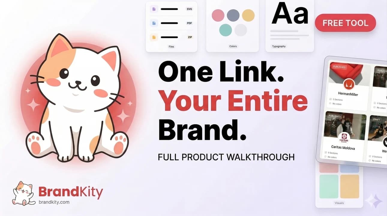
What Belongs in a Brand Kit? A Complete Guide for Designers and Teams
A strong Brand Kit should collect every asset, rule, and reference someone needs to use your brand correctly in one place. For BrandKity Blogs, this article can position BrandKit as the practical home for logos, colors, typography, visuals, files, and guidelines in a single shareable link. What is a Brand Kit? What is a Brand

Table of contents
- What is a Brand Kit?
- What should be included?
- What logos belong in it?
- What colors belong in it?
- What typography belongs in it?
- What visual assets belong in it?
- What files should be added?
- What source files are useful?
- What deliverables should be included?
- What brand rules belong in it?
- What writing guidelines should be included?
- What usage notes should be included?
- How should you organize it?
- How many sections should there be?
- Should you use one file for everything?
- What should you leave out?
- What makes a BrandKit too heavy?
- How does BrandKity help?
- Why is a browser-based kit better?
- How to build your first kit
A strong Brand Kit should collect every asset, rule, and reference someone needs to use your brand correctly in one place. For BrandKity Blogs, this article can position BrandKit as the practical home for logos, colors, typography, visuals, files, and guidelines in a single shareable link.
What is a Brand Kit?
What is a Brand Kit? It is a centralized collection of your brand’s core identity assets and usage rules, usually shared with clients, teams, vendors, and partners so they can apply the brand consistently.
Why does it matter? Because scattered PDFs, folders, and Figma files make brand handoff messy, while a BrandKit gives everyone one clean source of truth.
For BrandKity, the BrandKit concept is especially important because the product is built around a shareable portal where brand assets stay organized and always up to date.
What should be included?
A complete BrandKit should include the elements people need most often: logos, colors, typography, visual assets, deliverable files, and written guidelines.
You do not need to overload it with everything you have ever designed. Instead, include the assets that help someone apply the brand correctly without asking follow-up questions.
That balance keeps the kit useful, easy to browse, and fast to maintain.
What logos belong in it?
Logos should be one of the first items in any BrandKit because they are the most recognized part of the identity.
Include the main logo, alternate versions, icon marks, and reversed or monochrome variants when relevant.
It also helps to provide downloadable formats such as SVG, PNG, PDF, and AI where available so designers and developers can use the right file for each situation.
What colors belong in it?
Your BrandKit should include the primary palette, secondary palette, neutrals, and any accent colors that are part of the identity.
Each color should have a name and a hex code, and you can also add RGB, CMYK, or Pantone values when needed for print and production work.
In BrandKity, color swatches are meant to be practical, so viewers can click to copy the value directly.
What typography belongs in it?
Typography is a core part of brand consistency, so a BrandKit should include the primary and secondary typefaces, font weights, and suggested usage.
If a brand uses multiple fonts, explain which one is for headings, which one is for body copy, and when each should be used.
It is also useful to show sample text in the actual font so the viewer sees how the typeface behaves in context.
What visual assets belong in it?
Visual assets include photography, illustrations, patterns, textures, and supporting graphics that shape the brand’s look and feel.
If the brand relies on imagery, include examples that match the intended tone, along with tags or categories to make browsing easier.
For BrandKity, visual assets work best when they are filtered and easy to scan, because that keeps the portal usable for both designers and non-designers.
What files should be added?
A BrandKit should not stop at appearance. It should also include the practical files people need to work with the brand in the real world.
That can include pitch decks, business cards, letterheads, email signatures, social templates, and other finished collateral.
It can also include source files such as Figma exports, Sketch files, ZIPs, fonts, and documentation that developers or production teams may need.
What source files are useful?
Source files are valuable because they help teams build, edit, and extend the brand without having to recreate assets from scratch.
For example, a designer may need the original logo vector, a developer may need the font file, and a vendor may need a print-ready PDF.
Keeping these files in the BrandKit reduces confusion and gives each stakeholder the format they actually need.
What deliverables should be included?
Deliverables are the polished outputs of the branding process, and they belong in the kit because they are often the most commonly used assets.
Examples include brand guidelines, presentation decks, social media templates, stationery, and other files that represent the brand in customer-facing settings.
If you separate final deliverables from working source files, the BrandKit stays clearer and easier to navigate.
What brand rules belong in it?
A good BrandKit does more than store files. It explains how the brand should be used.
That means including brand story, tone of voice, messaging guidance, and any do’s and don’ts that protect consistency.
This is the part many teams forget, but it is often what saves the most time later because it answers common usage questions before they are asked.
What writing guidelines should be included?
Writing guidelines should cover tone, voice, language style, terminology, and key messaging points.
You might include sample headlines, words to use, words to avoid, and a short explanation of the brand personality.
That makes the BrandKit useful for marketing teams, sales teams, and external partners who write on behalf of the brand.
What usage notes should be included?
Usage notes help people understand the “why” behind the assets.
For example, you may note which logo version should be used on dark backgrounds, which color is the primary brand accent, or which font should never be paired with another font.
These notes prevent mistakes and reduce repeated back-and-forth between designers and clients.
How should you organize it?
The best BrandKits are easy to scan, simple to update, and organized in a way that matches how people actually search for assets.
Start with the most used items, such as logos and colors, then move into typography, visuals, collateral, and source files.
If the kit becomes too large, split it into sections or blocks so the viewer can navigate without effort.
How many sections should there be?
There is no single perfect number, but the kit should stay compact enough to browse quickly and complete enough to be useful.
A smaller brand may only need a few sections, while a larger identity system may need separate blocks for extended palettes, secondary logos, multiple font families, or campaign assets.
The key is clarity, not volume.
Should you use one file for everything?
A single PDF can work as a static snapshot, but it is usually not the best format for a living BrandKit.
A browser-based BrandKit is easier to update, easier to share, and much more practical for ongoing use because changes can stay live without re-exporting or resending files.
That is why BrandKity centers the experience around a web portal instead of a document.
What should you leave out?
A BrandKit should be focused, not bloated.
You should leave out outdated files, duplicate versions, unnecessary design experiments, and anything that does not help someone apply the brand.
BrandKity is also not meant to be a design tool, a file manager, a DAM, or a CMS, so your kit should stay centered on the assets and rules that matter most.
What makes a BrandKit too heavy?
A BrandKit gets too heavy when it tries to store every working file, every draft, and every idea the team has ever produced.
That makes the kit harder to use and harder to maintain.
Instead, keep only the files and guidelines that are current, approved, and relevant to real brand usage.
How does BrandKity help?
BrandKity is built for exactly this use case: creating a single, shareable BrandKit that keeps brand assets organized in one link.
It gives designers and teams a structured way to present colors, typography, logos, visuals, collaterals, and source files in a clean portal.
That makes handoff faster, client access easier, and brand consistency much easier to maintain.
Why is a browser-based kit better?
A browser-based kit is better because it is always available, easy to share, and simple for non-designers to use.
Viewers can copy color values, browse assets, download files, and open the brand on any device without special software.
For agencies and in-house teams, that reduces friction and keeps the brand system more useful over time.
How to build your first kit
Start with the essentials: logo files, the color palette, typography, and a short description of how the brand should feel.
Then add visuals, deliverables, and source files that support real-world use.
Finally, include written guidance so the kit explains not just what the brand looks like, but how it should be used.
A simple workflow looks like this: collect approved assets, group them into sections, add usage notes, and publish the kit as one shareable link.
That structure keeps the brand system clean and makes it easier for clients or teammates to trust what they see.
The result is a BrandKit that feels complete without becoming complicated.
Saurabh Kumar
Founder, BrandKity
Saurabh writes about practical brand systems, faster client handoffs, and scalable workflows for designers and agencies building repeatable delivery operations.
Connect on LinkedIn