What we believe
Solutions that stand the test of time always start and end with people. This cornerstone of human-centered design has guided us for a century. By focusing on people’s needs—not following shifting tastes or trends—we create original and timeless solutions that make an enduring impact.
Who we are
At Herman Miller, we believe in the power of design to make things better for people. Here’s how to unpack our guiding principle:
We use design as a powerful tool that allows us to solve for people’s needs.
At our heart, we’re a design company, not just a furniture company.
Everything we produce is as beautiful as it is useful.
Our products and services help people thrive in their environments.
What we do
At a time of unprecedented consumer choice, we differentiate Herman Miller as a brand through our actions. Today we have exponentially more touchpoints with our own customers than ever before in our 100-year history — here's how our behavior stays the course:
We set the bar for original design
We author design that is beautiful, useful, and made to endure — and we demand the same level of expertise and creative excellence from all our collaborative partners. Design is integral to the business.
We transform insights into solutions
Based on our ongoing research into how people live and work, Herman Miller is constantly evolving our point-of-view on how environments can meet emotional and functional needs — using that vantage point to solve problems for our customers.
We embrace a better way of living
Our investment in a responsible future touches every aspect of our business, resulting in paradigm-shifting product innovations, a commitment to a healthy and inclusive work environment, and an industry-leading focus on sustainability.
Logos
4 variants
Together, the logo, wordmark, symbol, and bug create our identity suite. The logo is used most often as it contains the most information, both the expressive symbol and informative wordmark. The symbol and wordmark are used next often, while the bug is reserved only for applications that require it.
Logo
Wordmark
Symbol logo
Bug logo mark
Colors
5 colors
The following values represent our core palette. These are used most often in the system and should be relied on when the color palette must be limited.
Typography
6 fonts
Typography is one of the most, if not the most, important communication tool for our brand. It carries our brand voice and with it we establish our tone, personality, and message. From the ornate shapes of Bodoni to the structural Helvetica to the humanist forms of Meta, many different eras of type design have been represented through our materials.
Söhne-BuchUploaded Font
Söhne-BuchKursivUploaded Font
Söhne-KräftigUploaded Font
Söhne-KräftigKursivUploaded Font
Söhne-HalbfettUploaded Font
Söhne-HalbfettKursivUploaded Font
Illustration
Illustration has played an important role in the history of our brand, creating some of our most iconic work from Alexander Girard, John Massey, Steve Frykholm and more. It is an important tool when photography either can’t be used or when needing a stronger or clearer point of view.
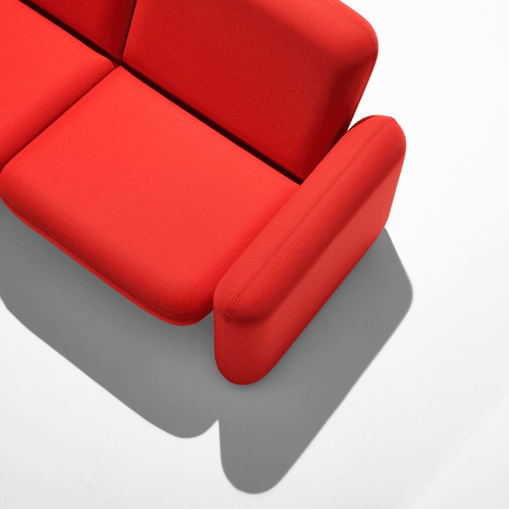
Photography
Photography is one of the most important elements in our identity system. It not only showcases our designs, but the spaces they inhabit, the people that use them, and the processes that create them. It captures the story of our brand.
Graphic Elements/Infographics & Composition
Graphic elements are used throughout our visual system to support elements like typography, color, and our identity. By using clear and recognizable imagery, they can structure information and create visual interest while adding to the legibility of a composition.
Information graphics are a crucial component for showcasing more detailed information. Whether product details, data, or timelines, various styles of infographics can be used to help make communication clear.
Each element in our visual system is designed to work together and dial up or down as needed to meet any communcation need. Composition principles determine how each piece can sit alongside one another to meet these needs.
Videos & Motion
Motion design adds a new layer to our visual language, bringing each element to life through various animated treatments. And Like motion, video captures the life and story of our content. It can highlight products, designers, processes, and history.
In use & Mockups
In this section, you will see actual examples of the Herman Miller brand identity system in use.
Icons
chair-01
chair-02
chair-barber
office-chair
chair-05
activity-05
Resources
HM Color Palettes.zip
6 KB
HM_Identity_Suite.zip
22.3 MB
HM-Presentation-Templates.zip
71.1 MB